Attendance Analysis Reports
Requirements
This tutorial requires the installation of the following applications/modules:
To view the Attendance Reports on Viindoo software, navigate to the Attendances app > Reporting.
View the Chart report
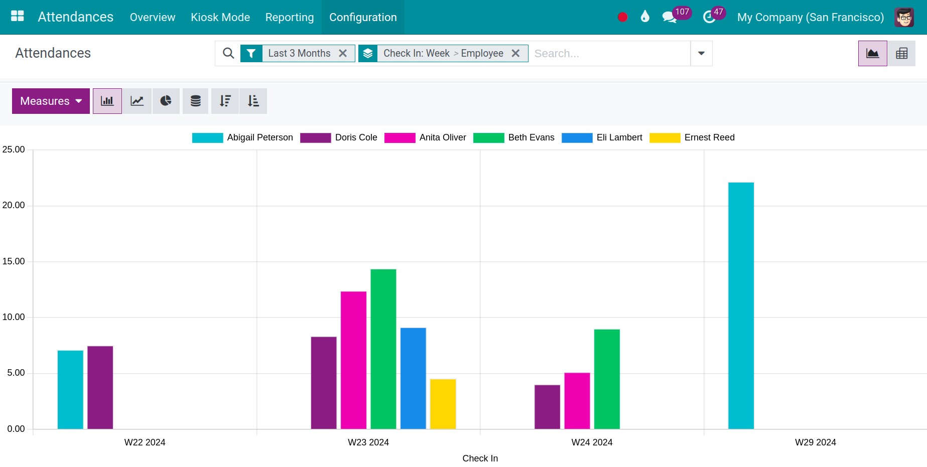
When you enter the reporting view, by default, the system will view the Chart report. The default report will be a weekly line chart report with Hours Worked for the vertical axis and quantity of Check In for the horizontal axis.
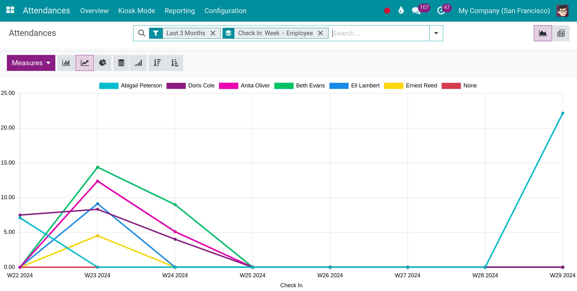
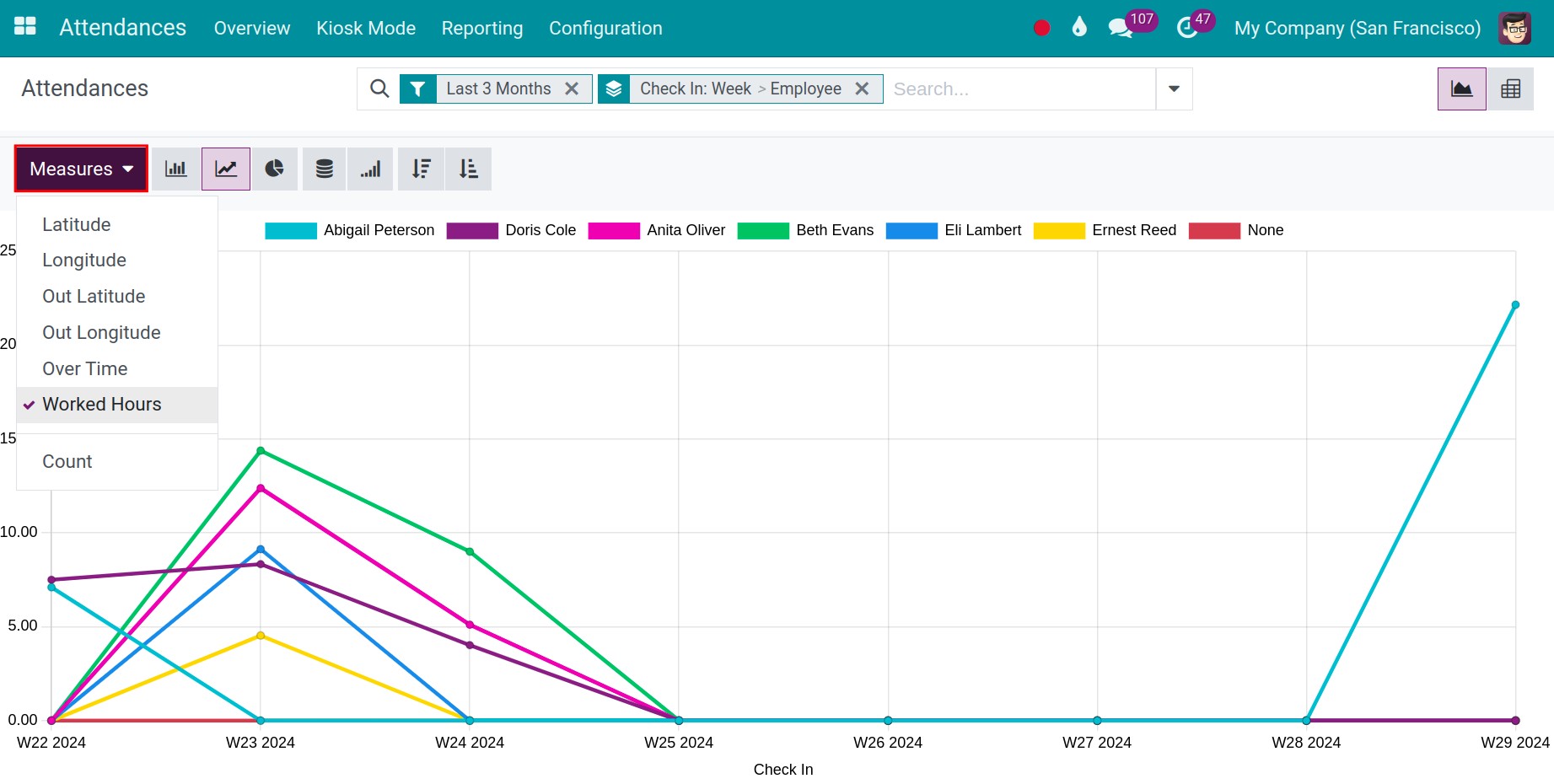
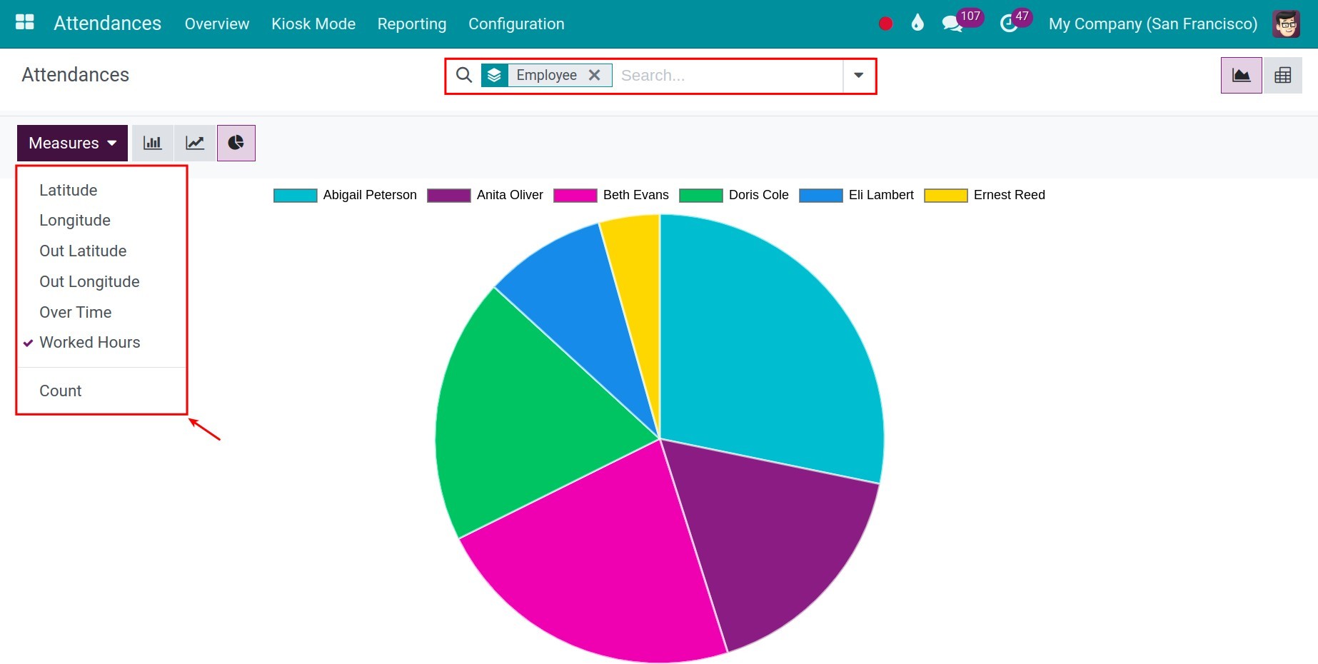
To change the criteria for the vertical axis, select another value on the Measures.
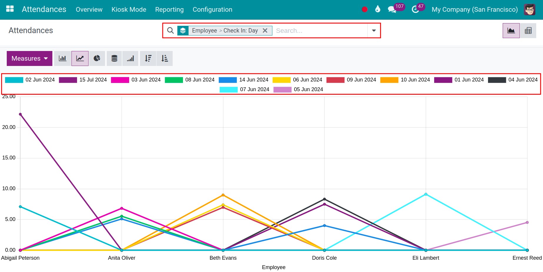
To change the criteria on the horizontal axis, you can use the filter and group tools. When there are multiple criteria on the horizontal axis, the system will show a Stacked report, making it a lot easier to understand.
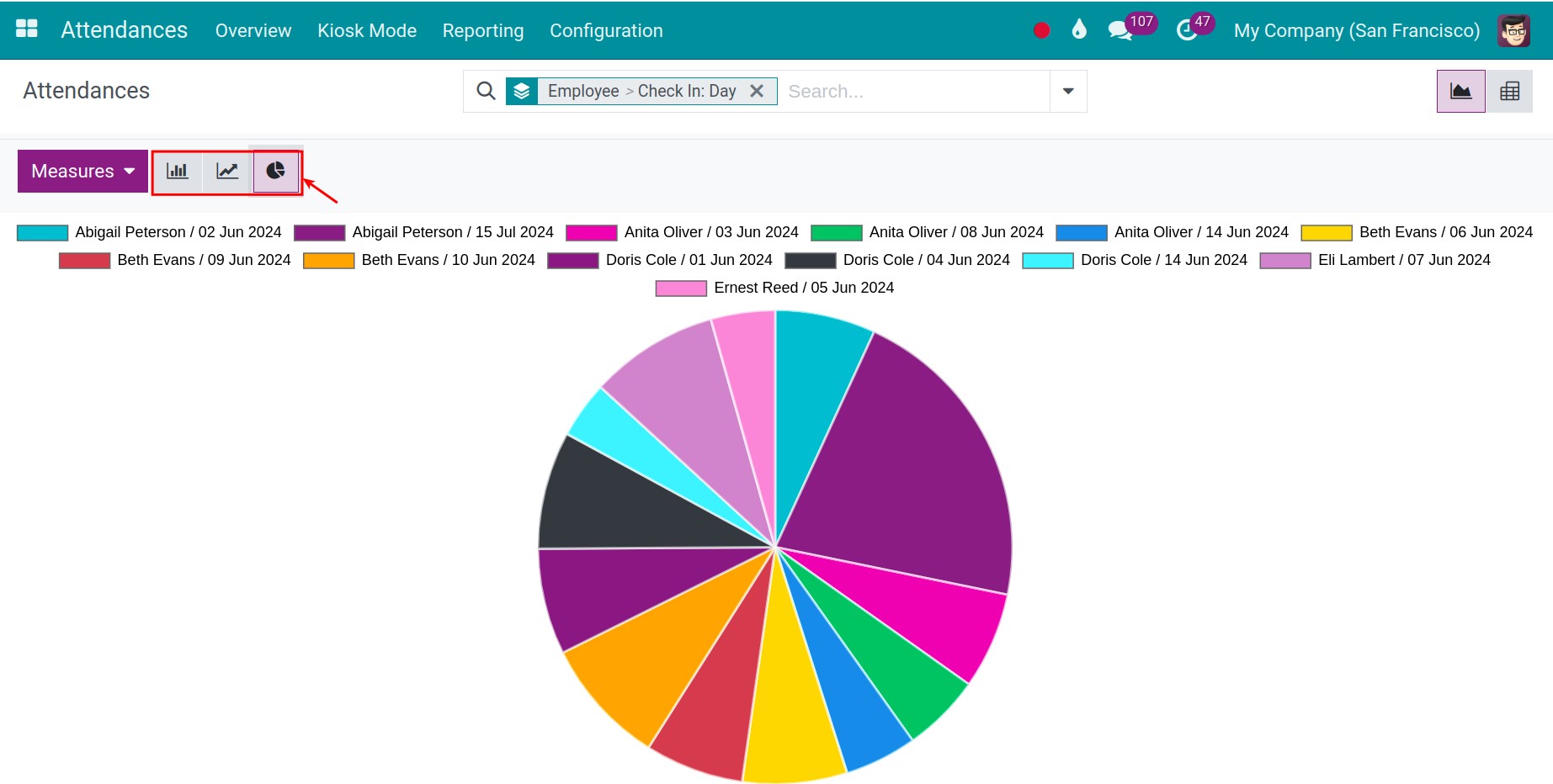
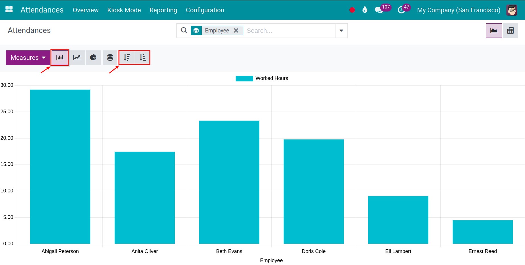
Besides the Line chart, you can also view the same report using the Bar chart and Pie chart.
Use the Measures and filter, group tools to view the report for the needed criteria.
Using the Bar chart and Line chart, you can select Descending/Ascending to view the report, making it more convenient for you when giving quotations.
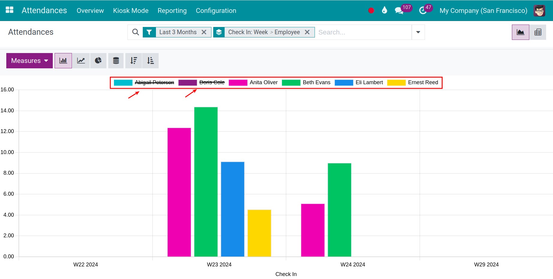
Furthermore, if you want to filter or review specific employees, you can click on those you want to hide as shown in the images below, instead of using the filter or group features.
View the Pivot report
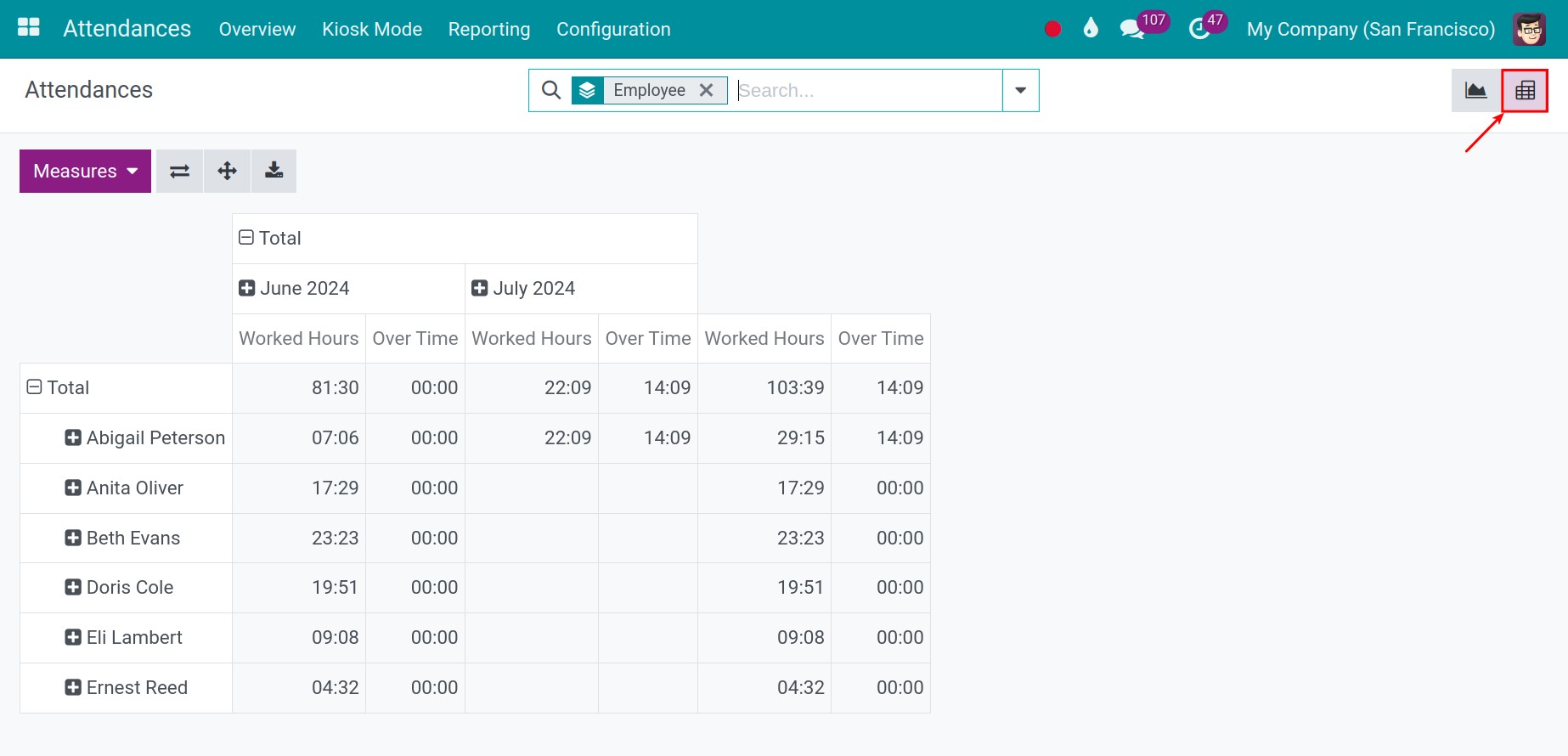
To view the Pivot report, select the Pivot icon.
You can use the filter, group tools to view the needed reports.
Select the suggested value on the Measures to view on the report. You can select multiple values.
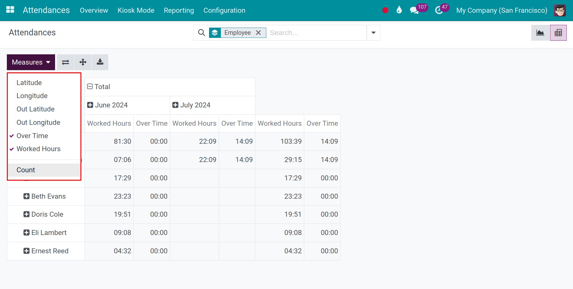
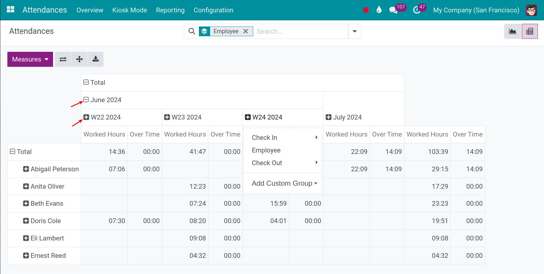
If the values on the Measure aren’t detailed enough, you can press the “-”/”+” icon on the criteria.
See also
Related article
Optional module