Attendance reporting
To view the Attendance reports, navigate to Attendances > Reporting.
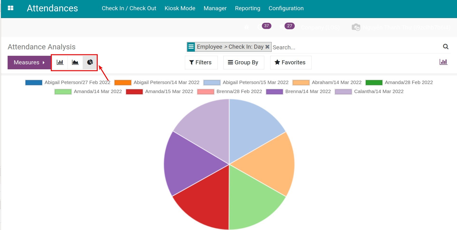
View the Chart report
When you enter the reporting view, by default, the system will view the Chart report. The default report will be a monthly bar chart report with Worked Hours for the vertical axis and Employee for the horizontal axis.
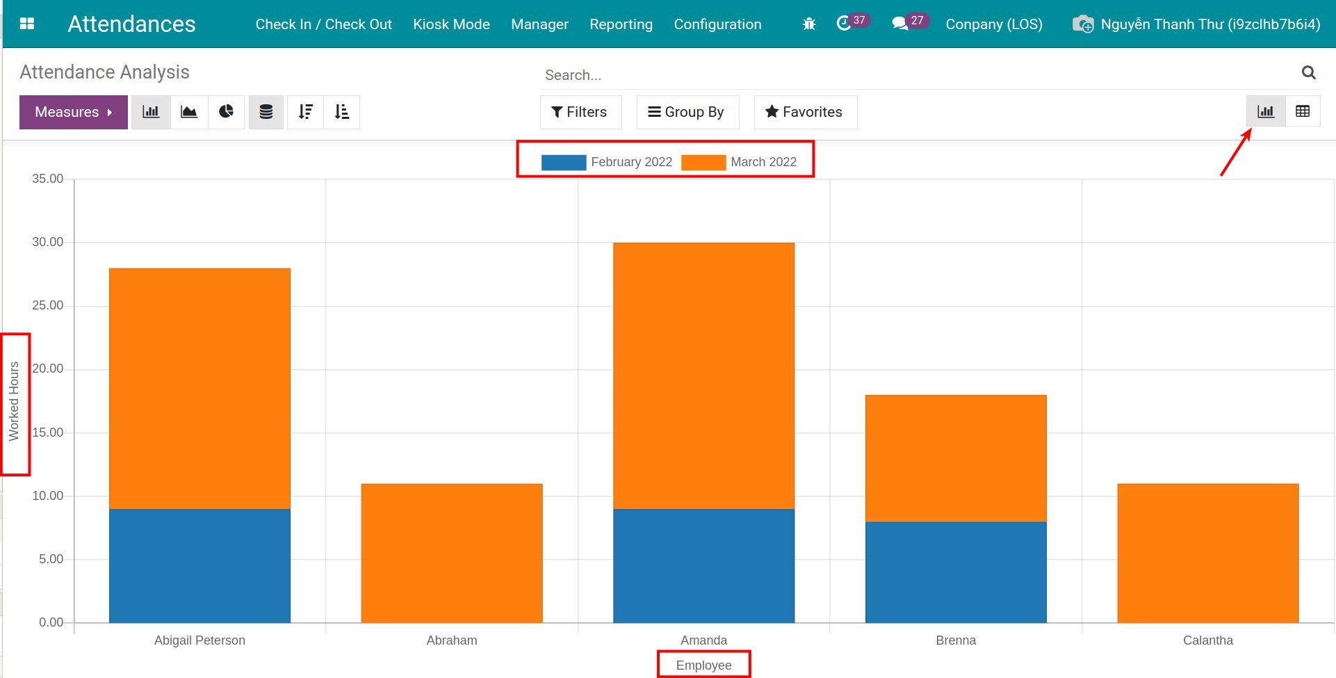
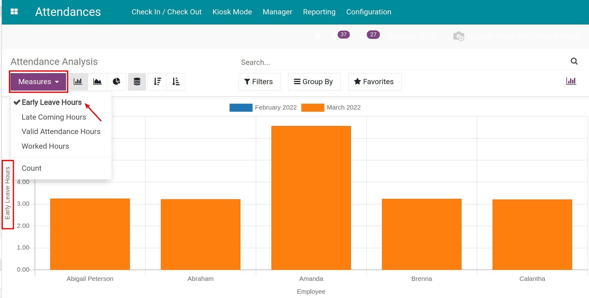
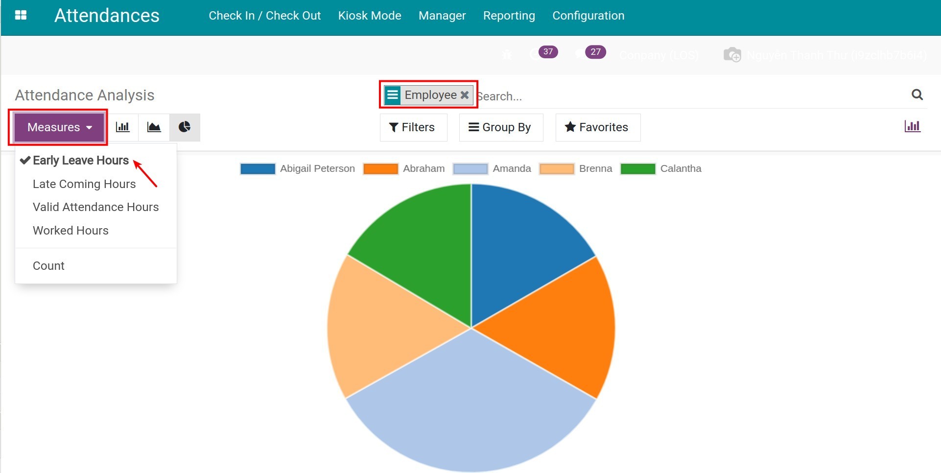
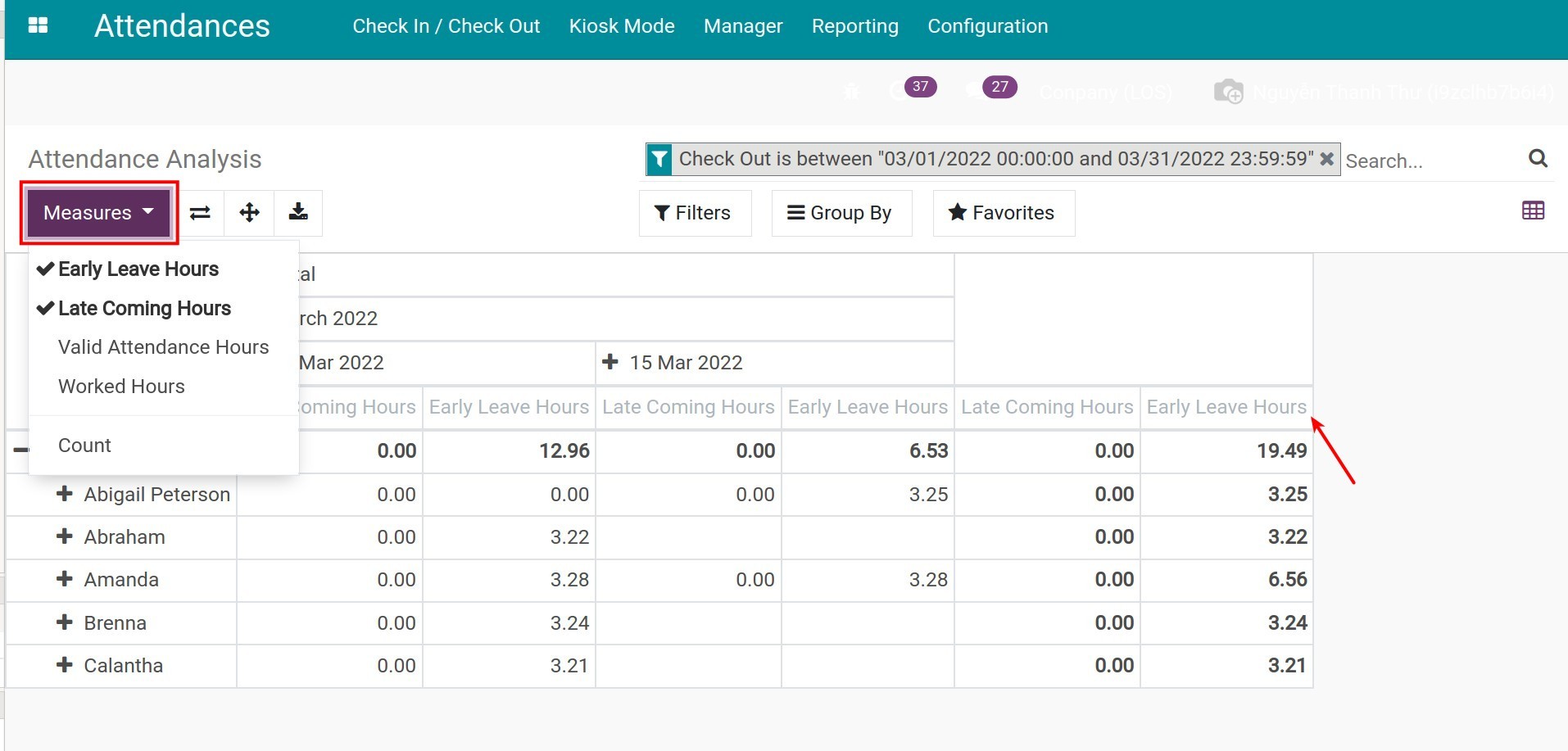
To change the criteria for the vertical axis, select another value on the Measures.
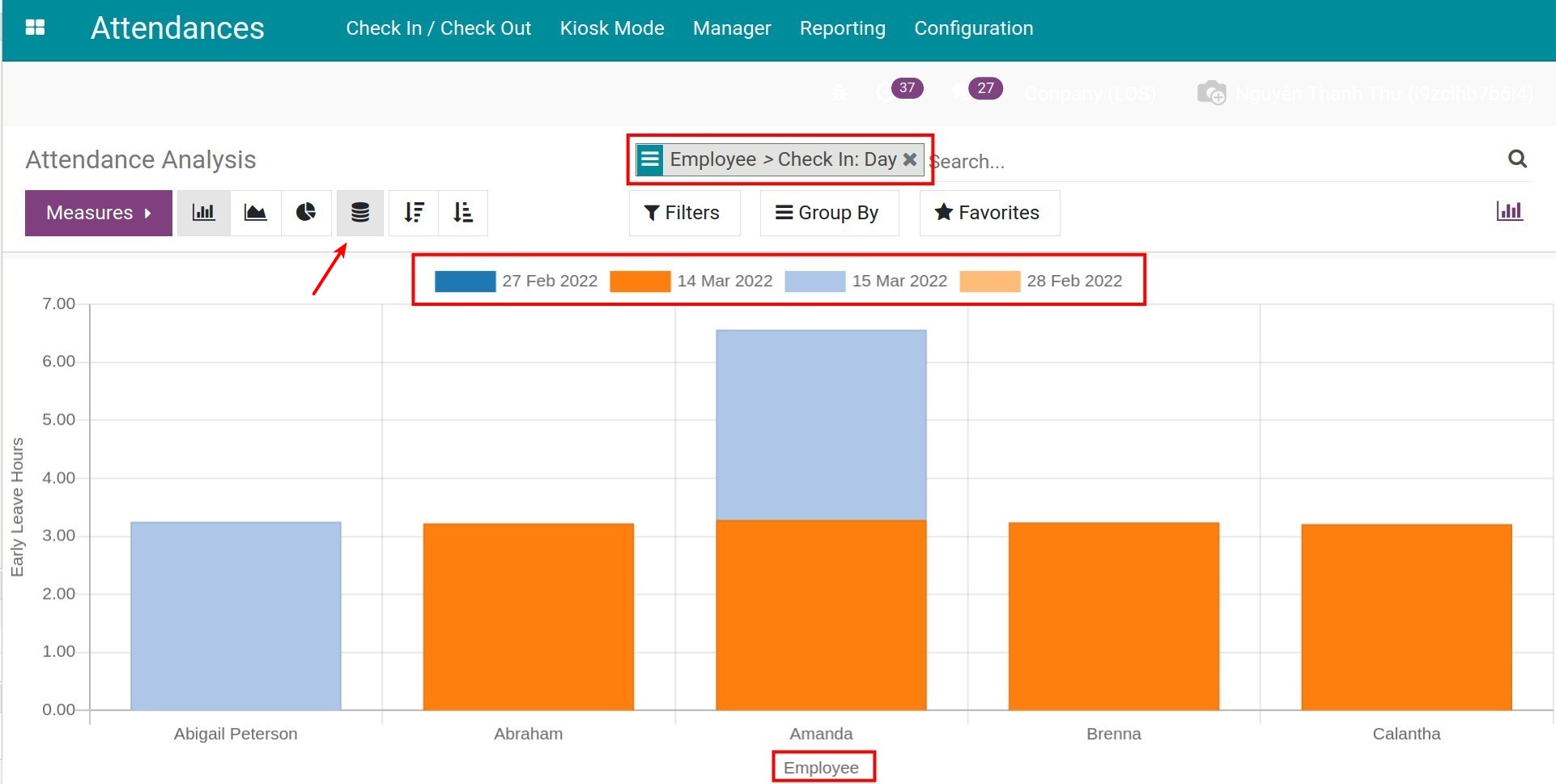
To change the criteria on the horizontal axis, you can use the filter, group tools. When there are multiple criteria on the horizontal axis, the system will show a Stacked report, making it a lot easier to understand. (Refer to Filter & Groups use cases).
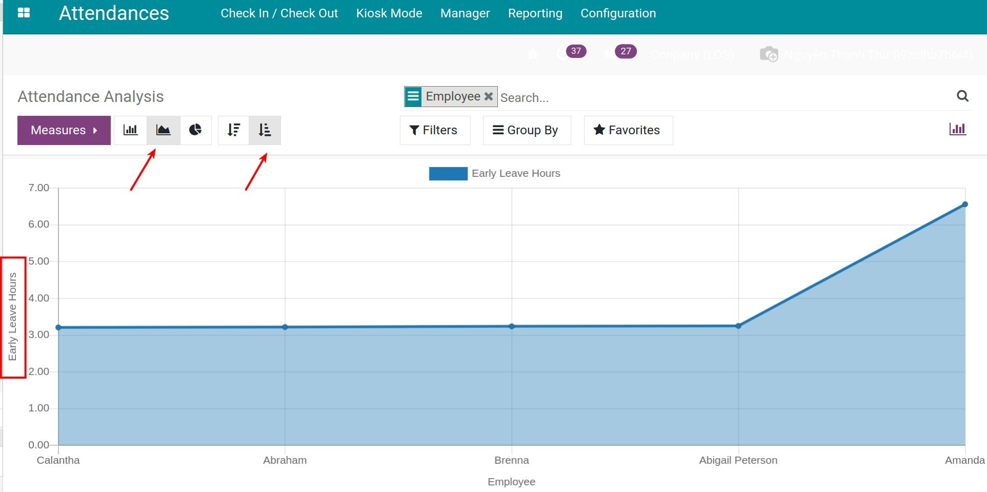
Besides the Bar chart, you can also view the same report using the Line chart and Pie chart.
Use the Measures and filter, group tools to view the report for the needed criteria.
Using the Bar chart and Line chart, you can select Descending/Ascending to view the report, making it more convenient for you when giving quotations.
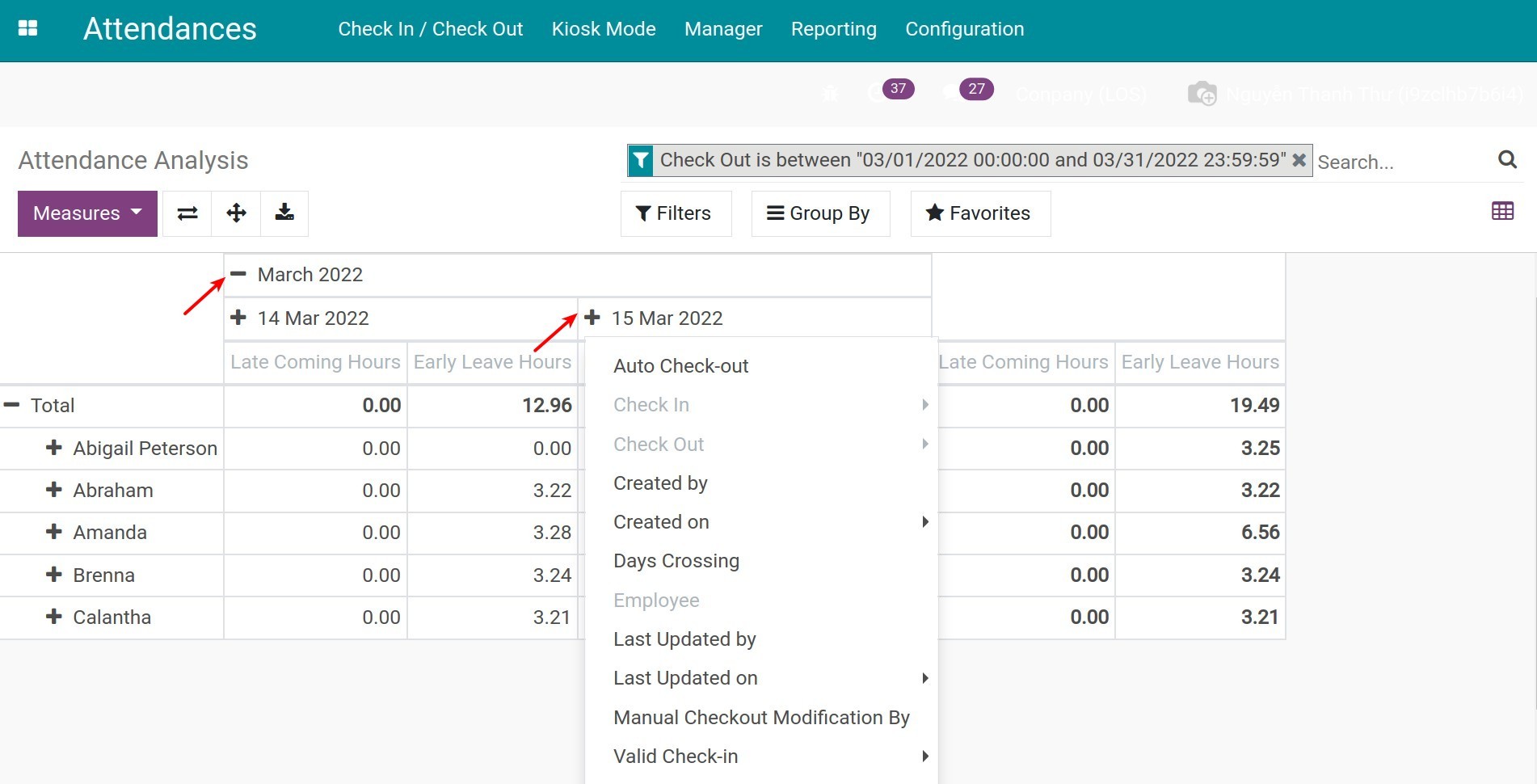
View the Pivot report
To view the Pivot report, select the Pivot icon.
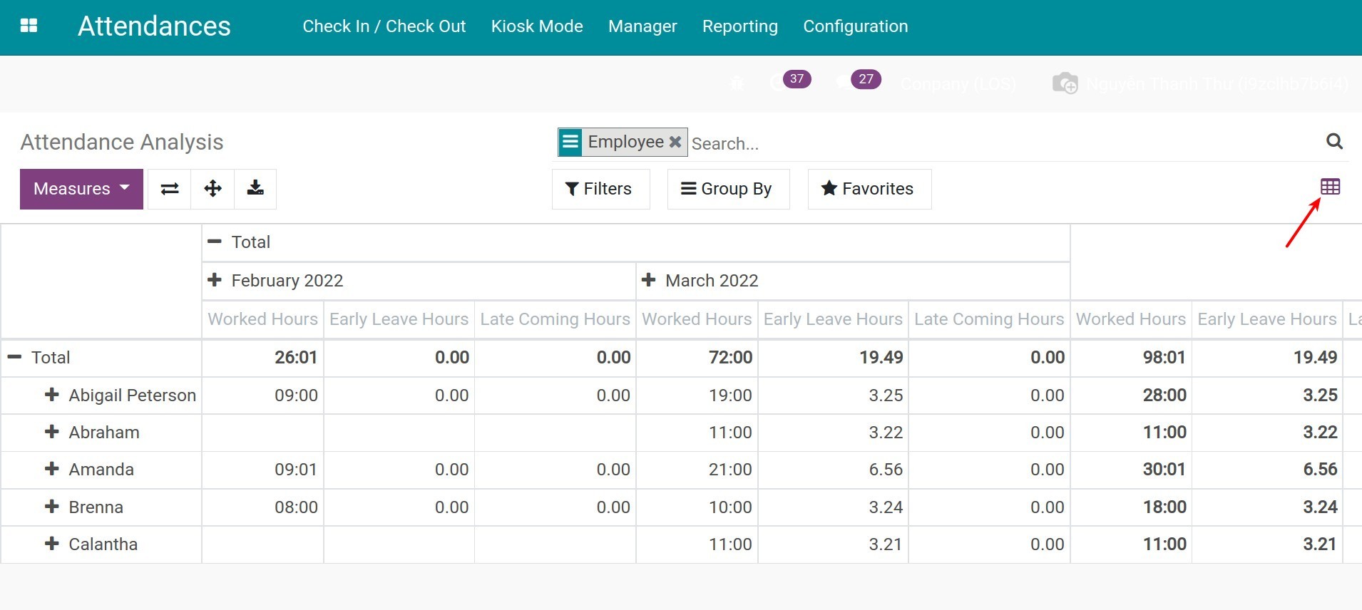
You can use the filter, group tools to view the needed reports.
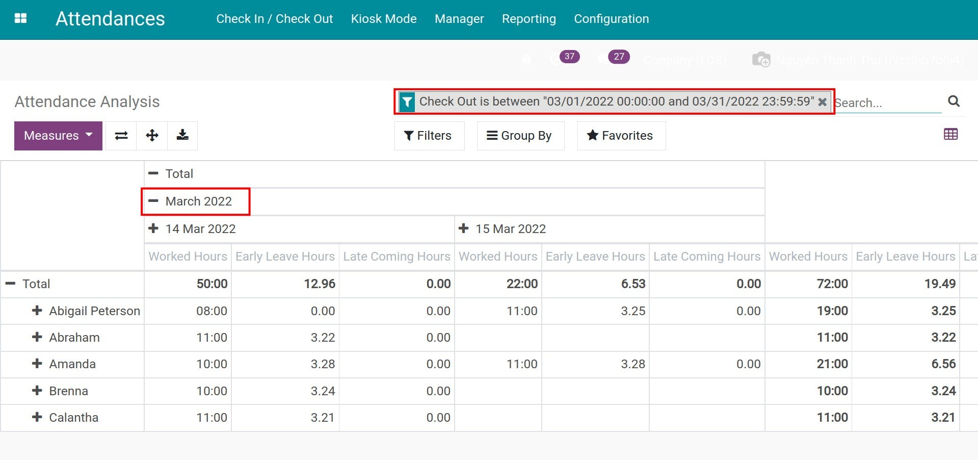
Select the suggested value on the Measures to view on the report. You can select multiple values.
If the values on the Measure aren’t detailed enough, you can press the “-”/”+” icon on the criteria.