Overtime Reports
Through the overtime reports, the managers will be provided with an overview of how long the employee works overtime, how to make overtime plans for employees or the amount paid for the overtime, etc.
The Overtime app in Viindoo system supports different types of reports such as line, bar, pie, calendar, or pivot.
View Reports in Pivot
To view overtime reports, access . Here display a pivot report that provides figures to analyze overtime plans by each employee/department or position.
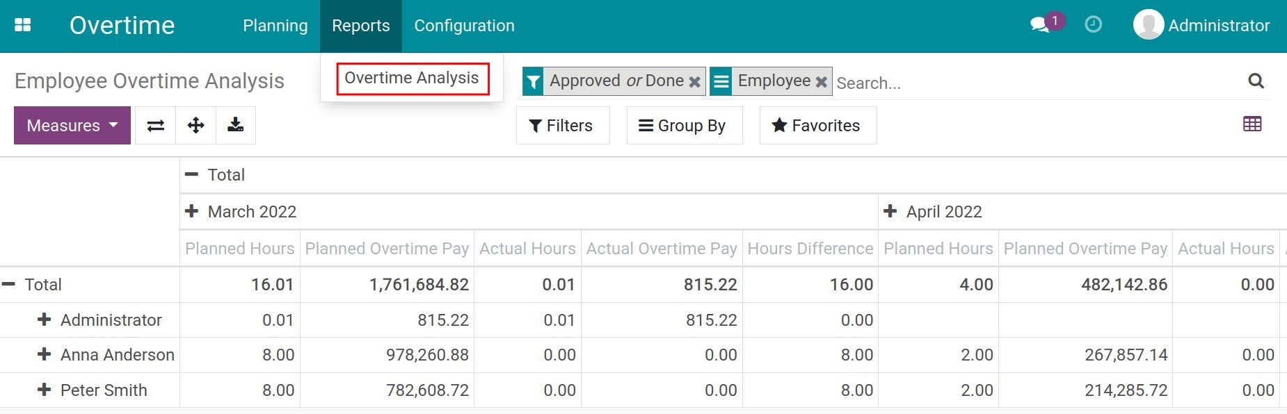
By default, the system will display reports by Employee and filter overtime request criteria in Approved or Done state. In addition, the criteria in the row by Month and Planned Hours, Planned Overtime Pay, Actual Hours, Actual Overtime Pay, Hour Difference.
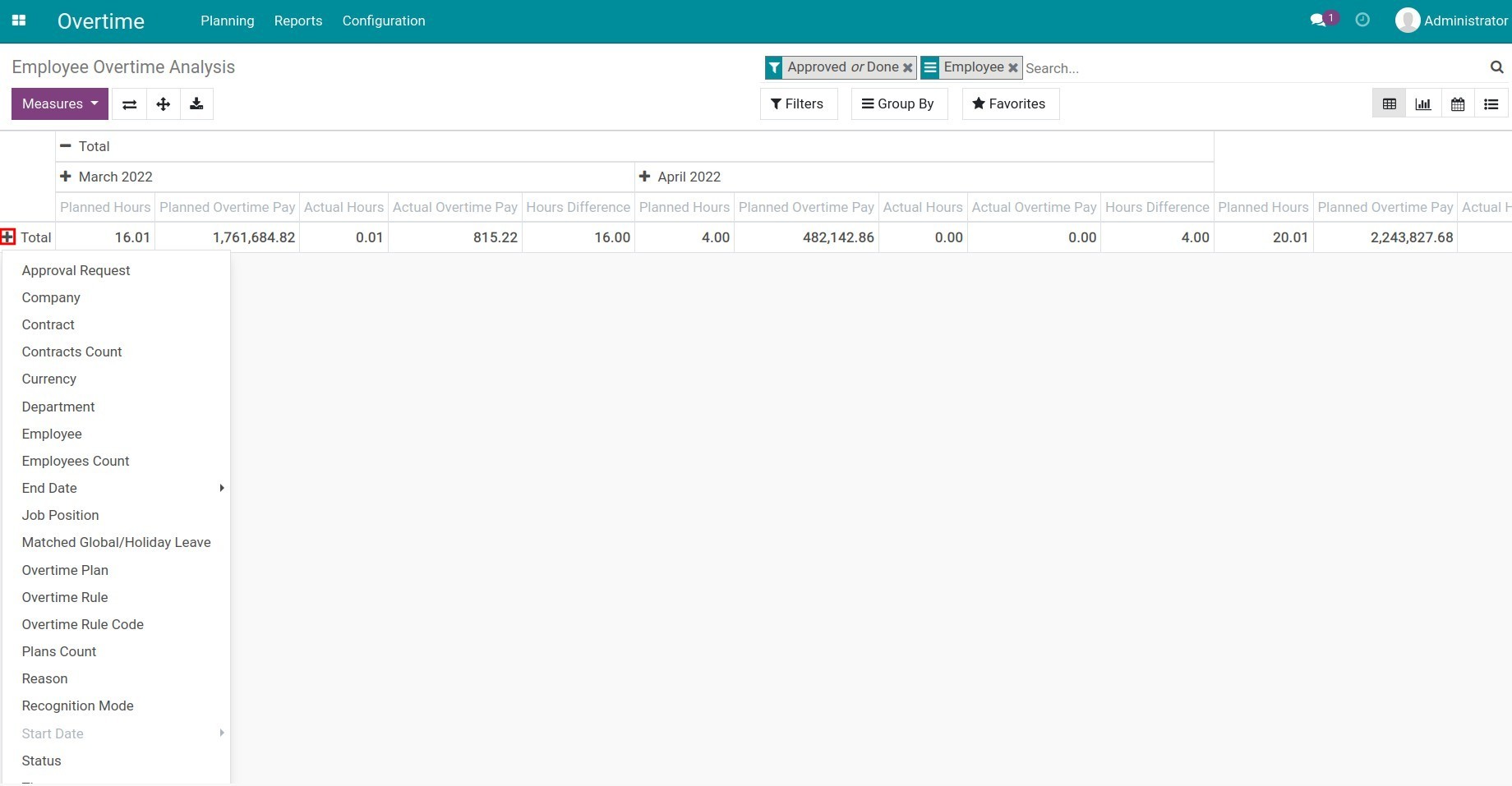
To change the row values, you use the criteria at Measures.
Click on the + to select the criteria that you want to see. For example, reports by Department, Employee, Reason, etc.
You can view the report directly on the software or export report to excel by clicking the Download xlsx.
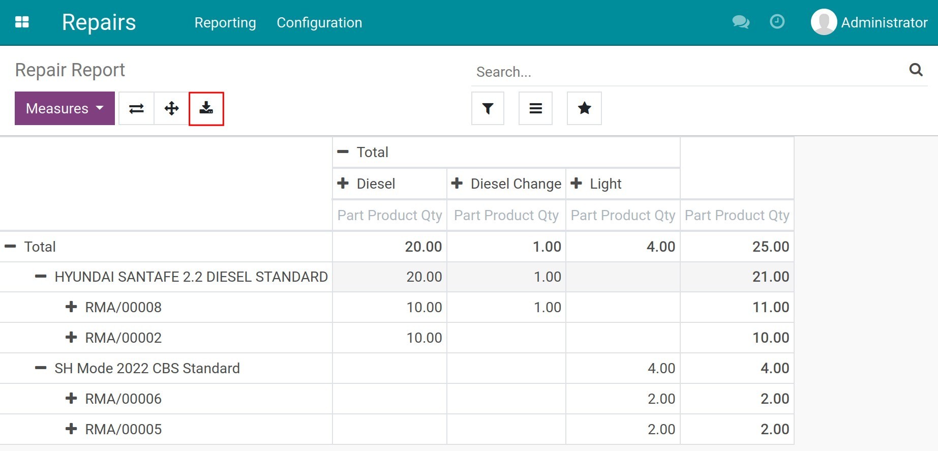
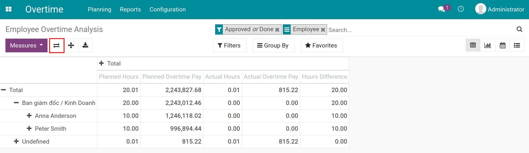
In addition, you can exchange all the criteria in columns and rows for each other.
View reports in Graph
To change to graph reports, you click on the corresponding icon. The system will display a bar chart by default.
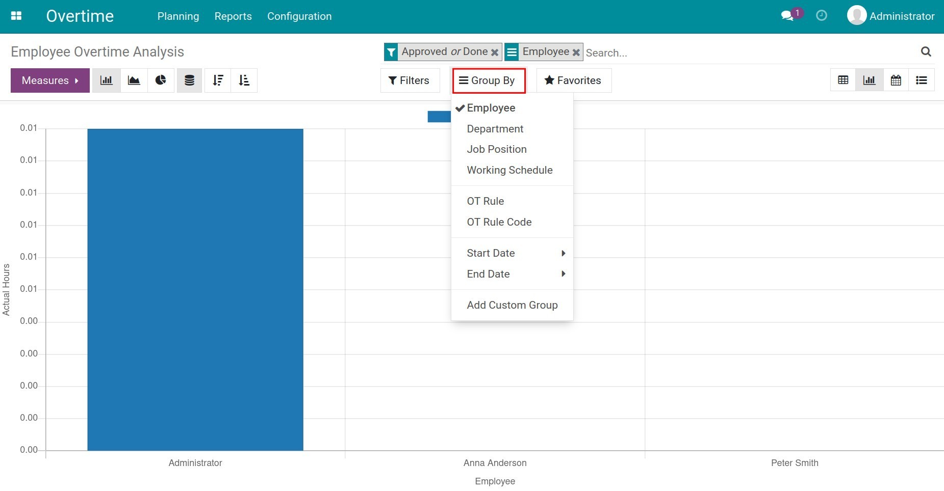
Vertical axis value: used as criteria in Measures. Unlike the pivot type, graph report only allow to select one criterion for display.
Horizontal axis value: display name of employees. In case you want to change the horizontal axis value, use the Group by. Based on the needs of the enterprise, the software proposes the group criteria by default such as by Department, Job Position, Working Schedule, OT Rule, OT Rule Code or Start Date/End Date. With Add Custom Group, you can add more criteria depending on the purpose.
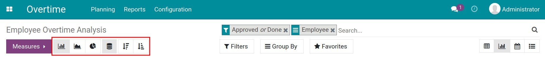
The software supports different types of charts such as: bar chart, stacked bar chart, pie chart, line chart. You use corresponding icons to switch to other types. Or it is possible to arrange the horizontal axis values in ascending or descending order.
View reports in other types
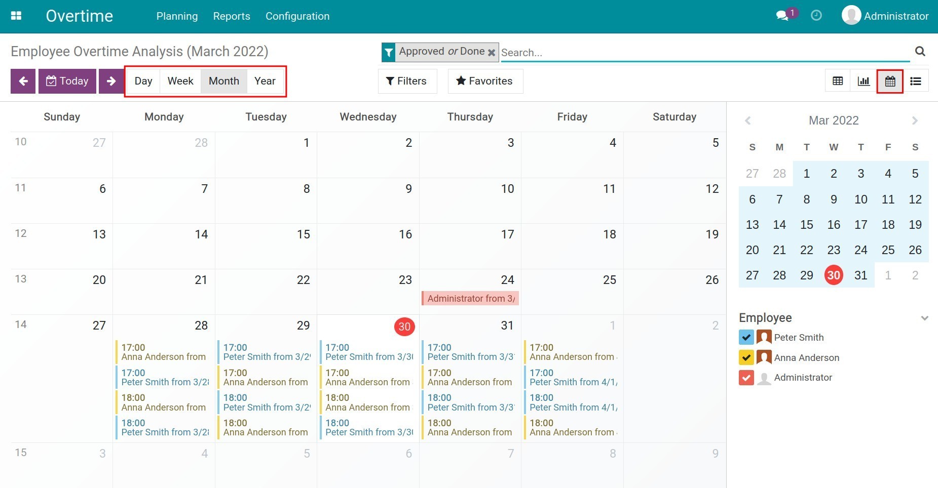
At view Calendar, you can look at the overtime plans of the entire employee in the form of a calendar, specifically by Day/Month/Year to see an overview of their overtime.
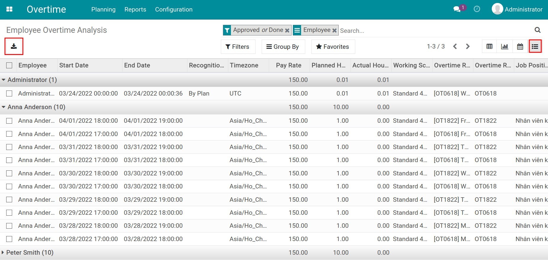
At view List, you use Filters and Group by to do custom reports according to your purpose. See more at Filter, Groups and Search use cases. With this type, the software also supports export to excel.