Sales Analysis Reports
Viindoo Sales report gathers all the information recorded in the Sales app. The reports have all the data and tools to help the managers trace all the information, from overview to the most detailed. The reports can be displayed in pivot; pie, line, and bar charts in real-time, helping the manager allocate resources as well as planing the sales strategies.
Requirements
This tutorial requires the installation of the following applications/modules:
The default reports of the system include:
Sales report: Gather the information related to sales revenues on the quotations and orders.
Dashboard: An overall report with many criteria such as salesteam revenue, cohort or statistics of orders, products, closing order time, etc.
To view these reports, navigate to Sales ‣ Reporting and select the report you want to see.
Sales report
Sales reports allow analyzing and tracking sales, measured by salesperson, sales teams, products, order date, etc. and display those data in different report types, for example, bar, line and pie charts.
Bar, line, pie chart in sales reports
Sales reports are displayed in bar, line and pie charts. You need to Filter, Groups and Search use cases and use Measures to set up the report.
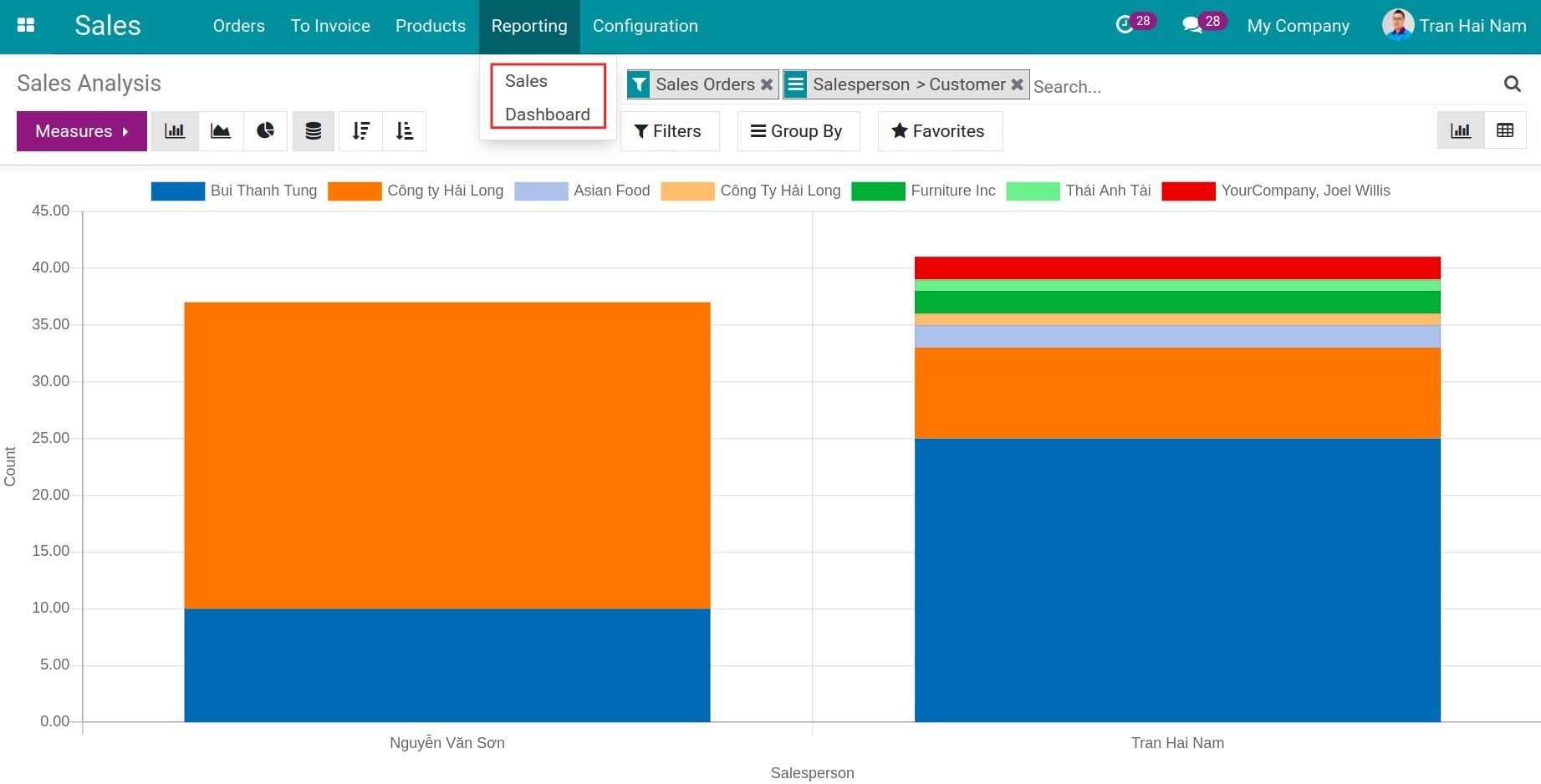
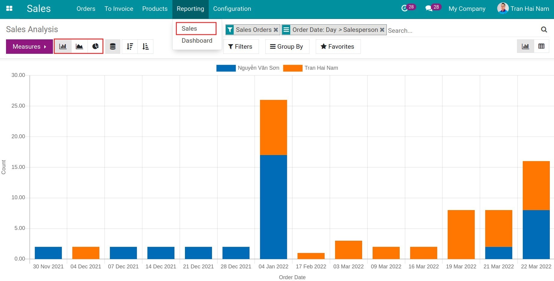
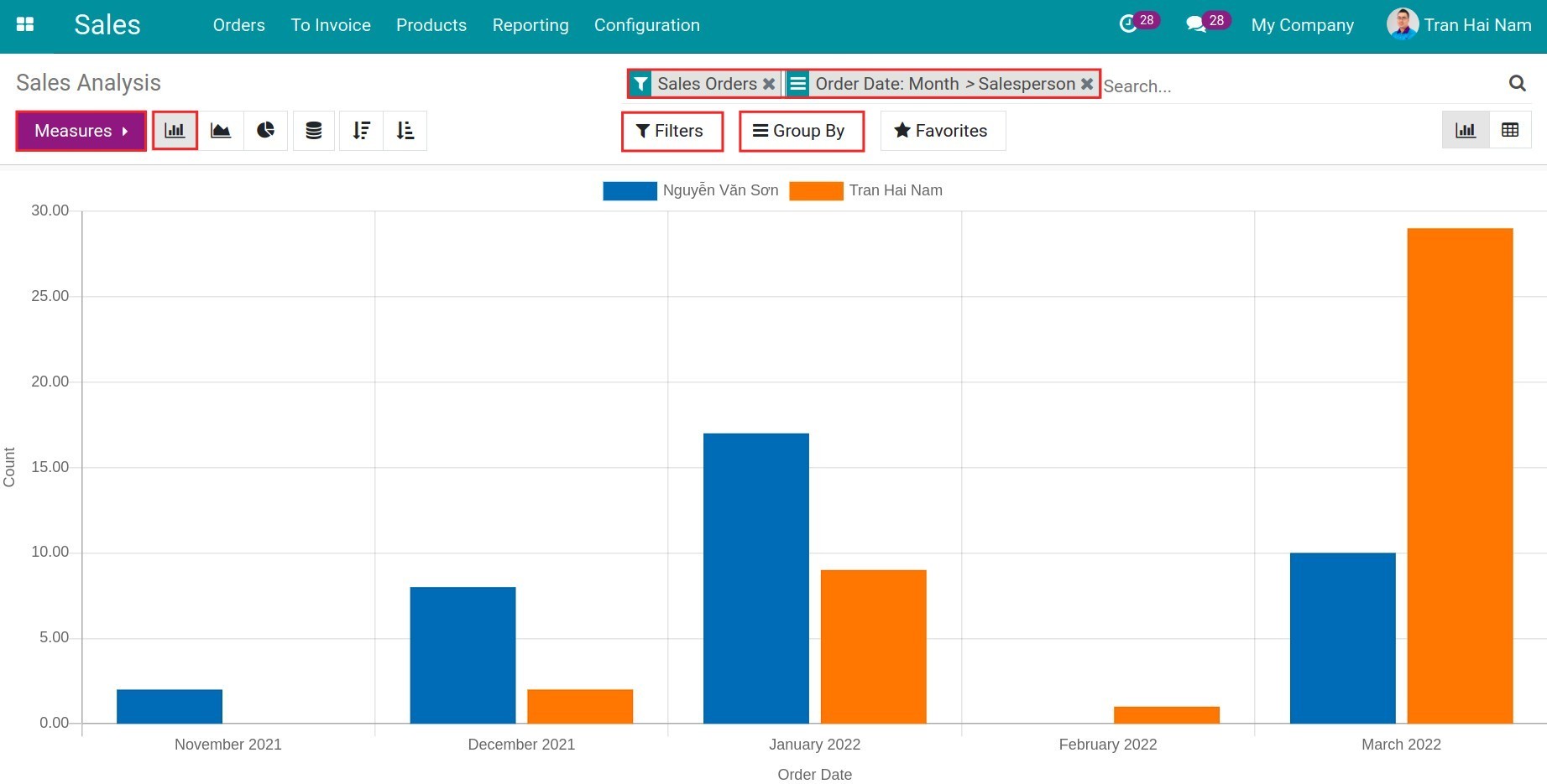
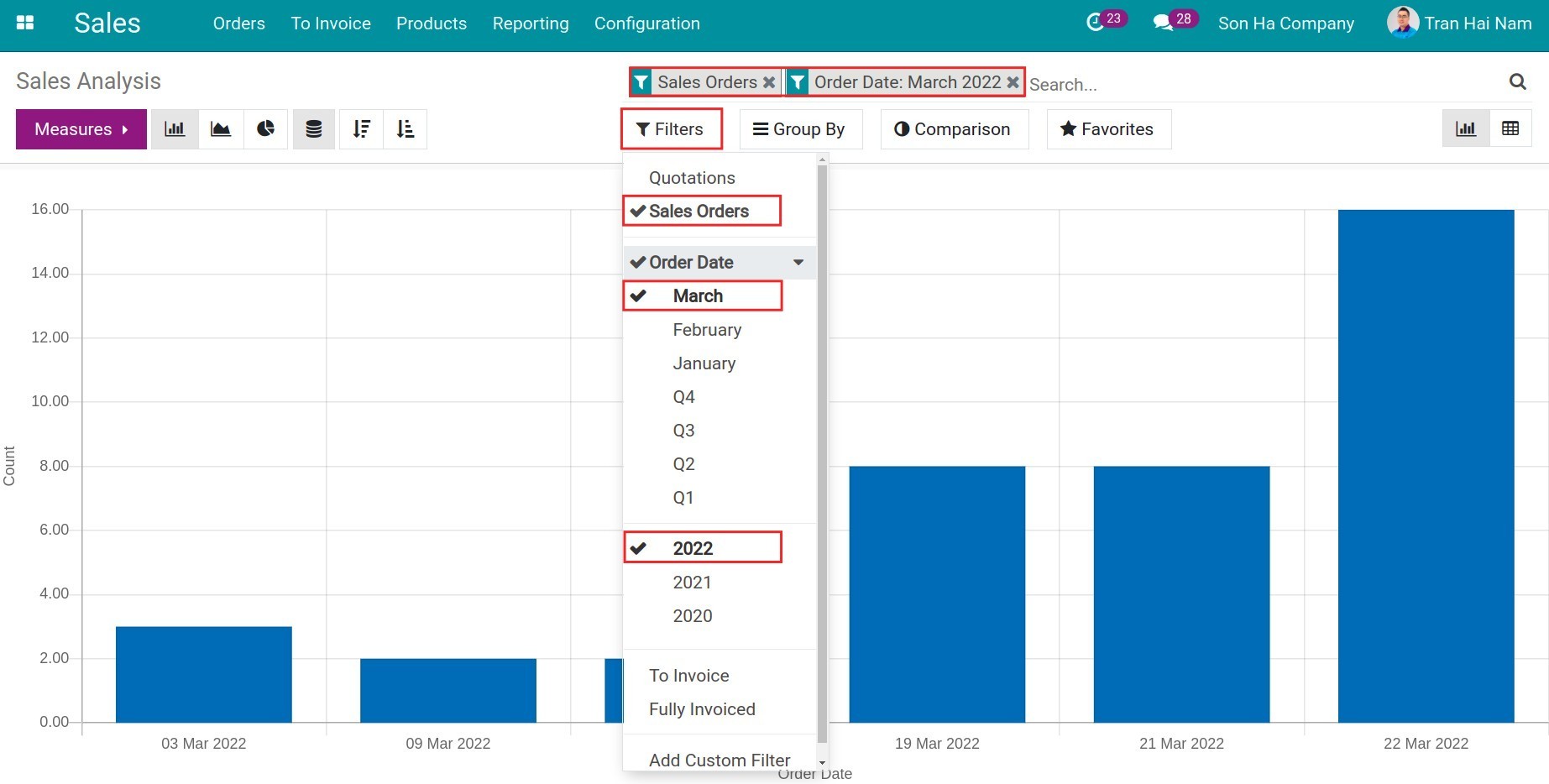
Bar chart
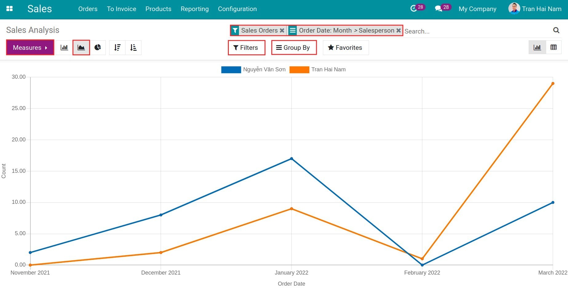
Line chart
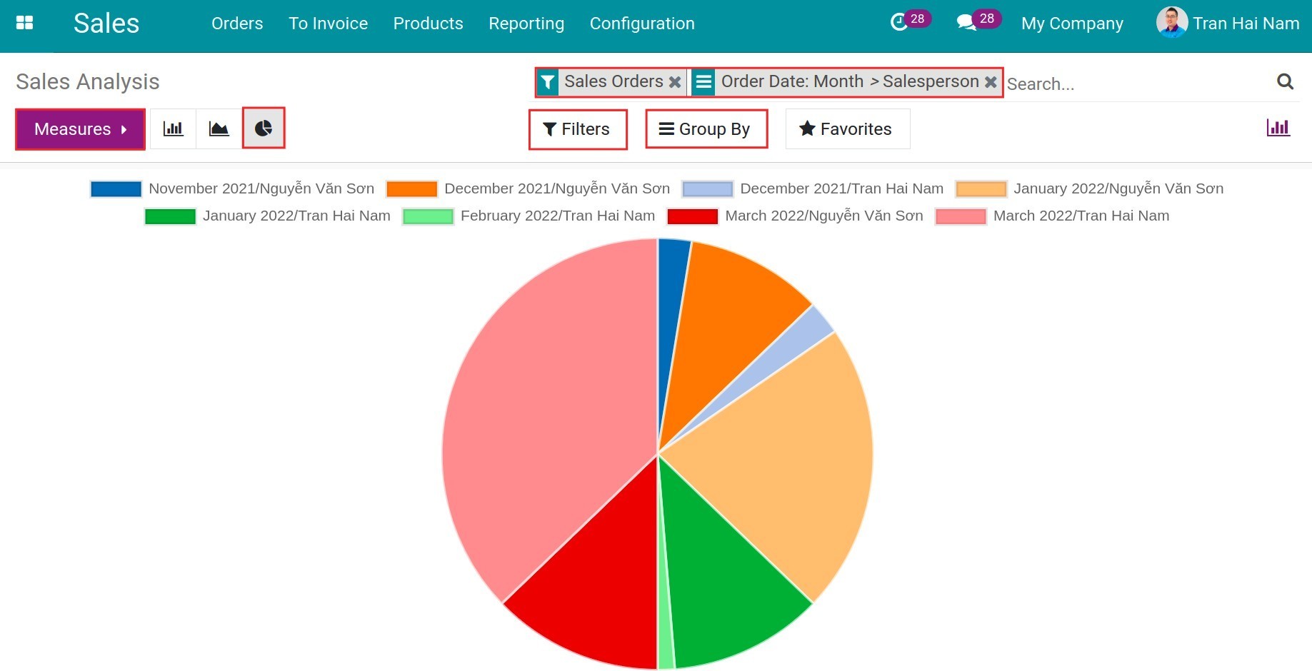
Pie chart
Filter the report
Depending on the user’s needs, you can view the report according to different criteria. To create your own filters instead of the default one, you can use Filters.
Filter according to A criteria “and” B criteria
For example: filter “Sales Orders” and “Order date in March”, the reported data will only be the sales orders of March.
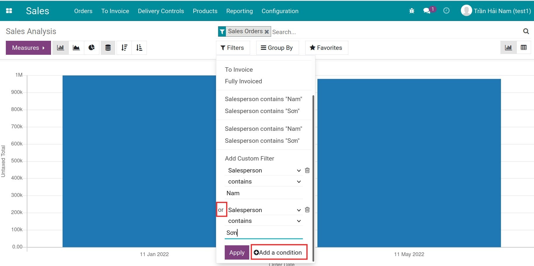
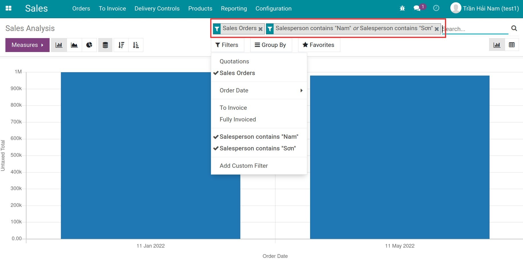
Filter according to A “or” B criteria
For example: filter according to Sales Orders, continue to filter Salesperson contains “Sơn” or Salesperson contains “Nam”.
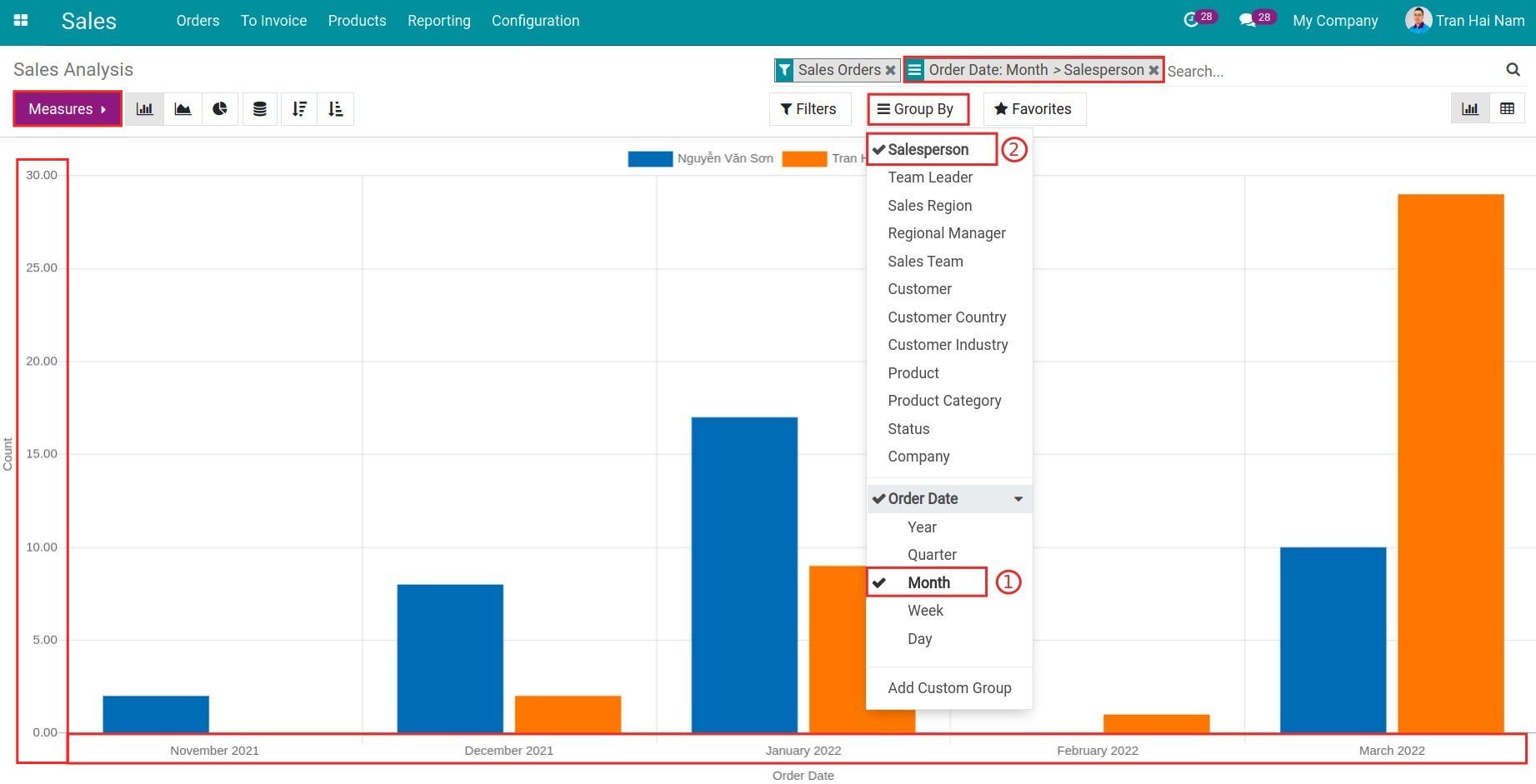
Use Measures and Group By to view reports
Measure: Display the “Criteria” and “Unit” on the vertical axis of the sales report.
Group by: group the subjects of the report criteria, displayed on the horizontal axis of the report.
For example:
Measure: “Counts”, the vertical axis of the report displays the “number” of sales orders.
Groups by: Group by “order month” and “salesperson”, the horizontal axis of the report groups the data according to the order month and the salesperson.
Note
Use Filters, Group By, Measures flexibly to view the best report for you.
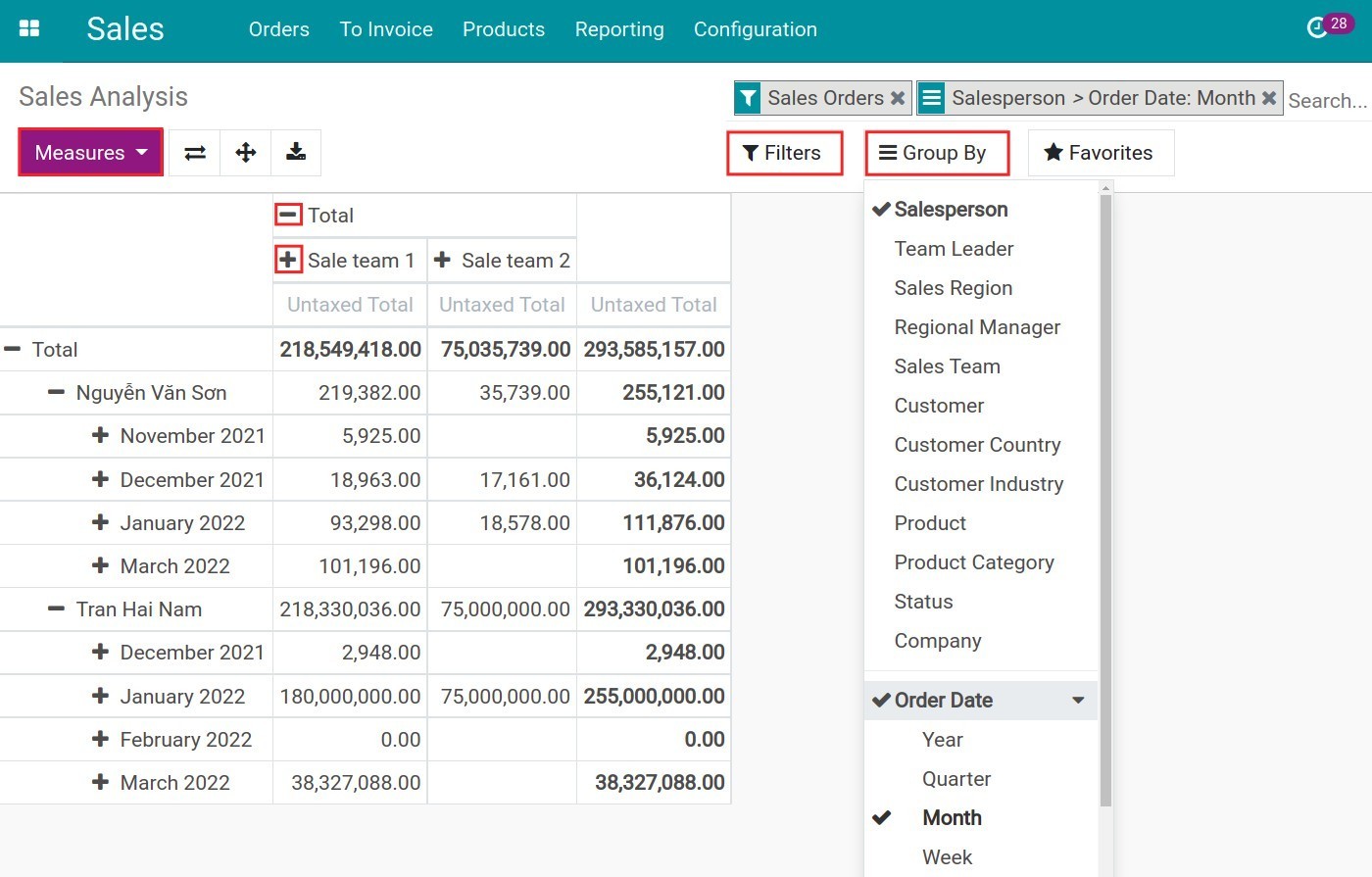
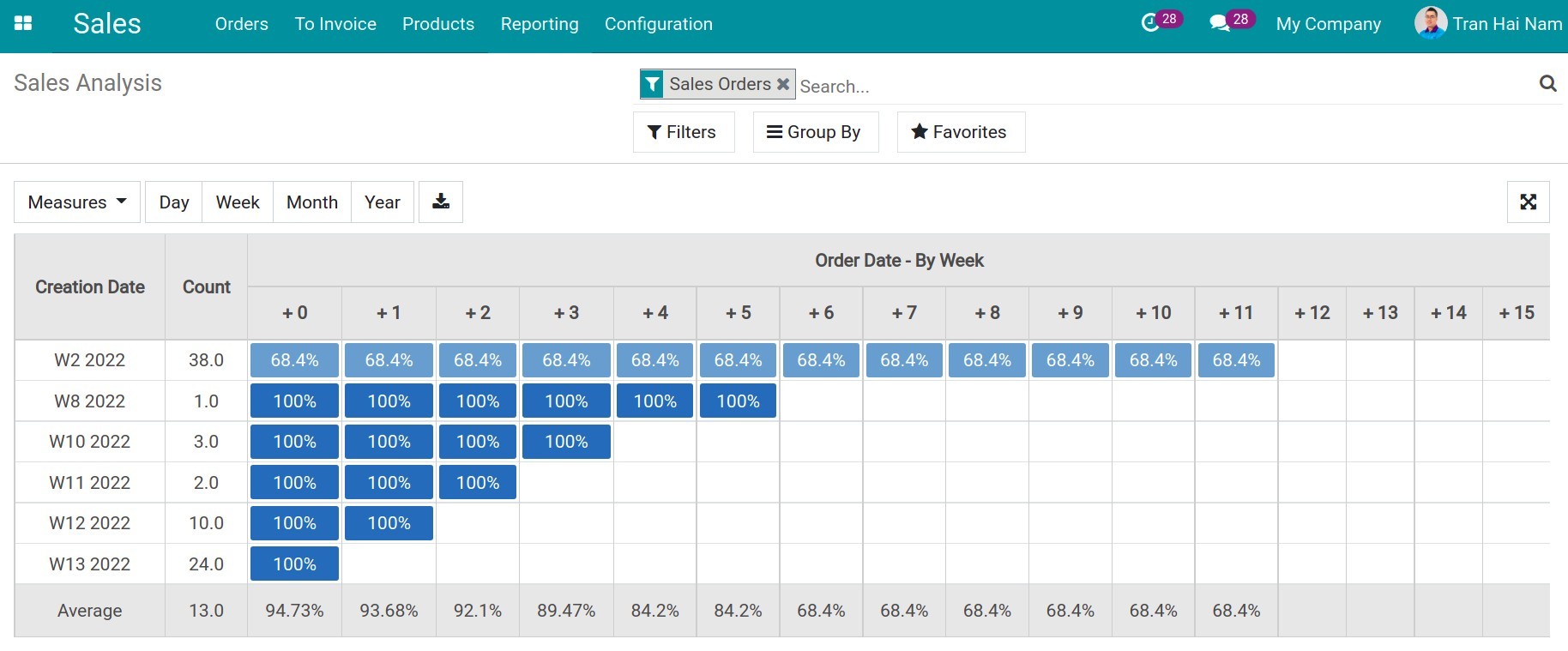
Pivot view of sales report
You can view the pivot report to analyze the data in detail. Similarly, users can view the data with needed criteria. Click on “+” or “-” icon to expend/close the evaluation criteria.

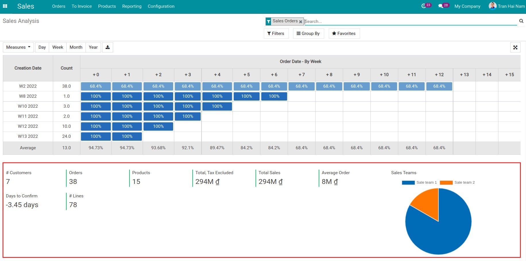
Dashboard
The sales dashboard is displayed in charts, pivot, cohort, etc. It provides managers with an overview of sales information and activities.
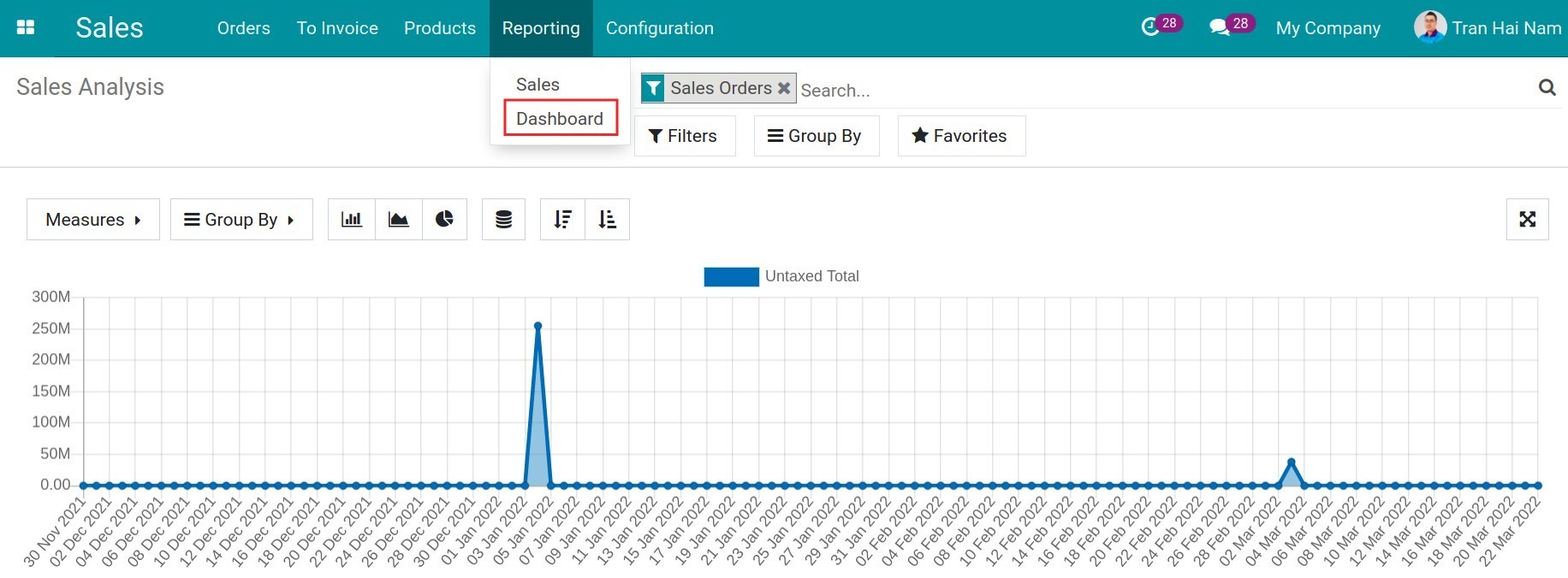
Enter the Sales app, navigate to Reporting ‣ Dashboard the system will show the default report.
Line chart, bar chart and pie chart of the dashboard report
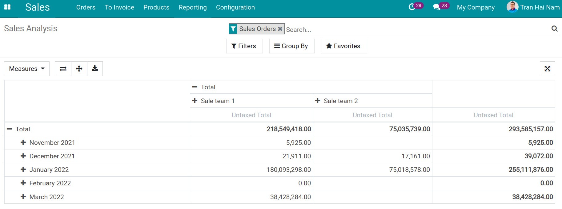
Pivot report view
Cohort report view
Dashboard report statistics
Note
In case you want to export the report data into an excel with the needed criteria, you can refer to Guiding to import and export data.
See also
Related article
Optional module