Lead/Opportunity Analysis with Sankey Chart
A Sankey chart is a type of statistical chart, used to represent and analyze the flows or processes of exchange between different elements in a system. This diagram is named after Matthew Henry Phineas Riall Sankey, an Irish physicist, who used it to illustrate the flow of energy in a report he wrote in the late 19th century.
In a Sankey chart, blocks or columns are arranged vertically, and the lines between them represent traffic or conversion between them. These widths correspond to the amount of flow or transitions corresponding from one element to another. Sankey charts are often used to represent processes in energy, environment, economics, or other fields to help better understand processes and solutions to related problems.
Using the Sankey chart in the CRM app, helps you analyze and visualize the conversion ratio from Leads/Opportunities to Sales orders.
Requirements
This tutorial requires the installation of the following applications/modules:
Note
Based on the access right in the Sales app, you can access the reports to analyze the leads/opportunities of your own or your teams or your whole company.
Install the required module
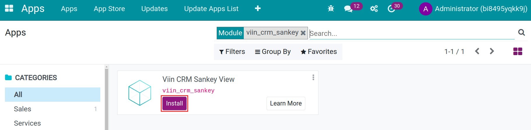
First, you need to install the module viin_crm_sankey by navigating to Apps, remove the Apps default filter, find the module viin_crm_sankey and press Install:
Using Sankey chart in Leads/Opportunities’ conversion rate analysis
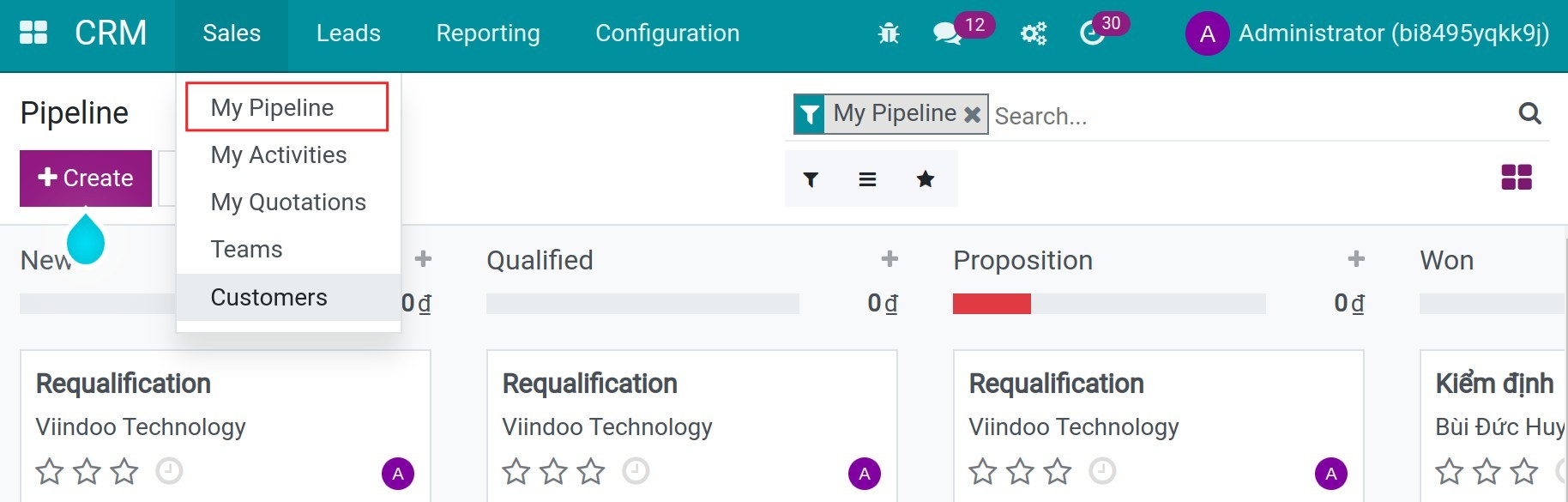
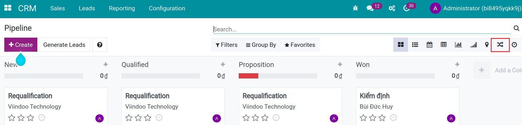
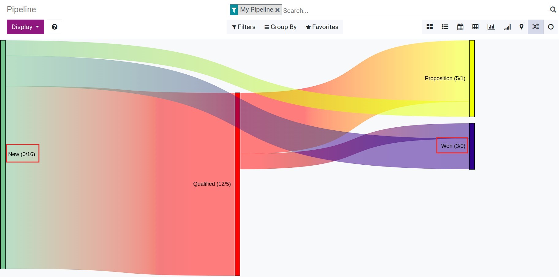
To view the Sankey chart, navigate to CRM ‣ Sales ‣ My Pipeline, and select the icon of Sankey view to see the respective report.
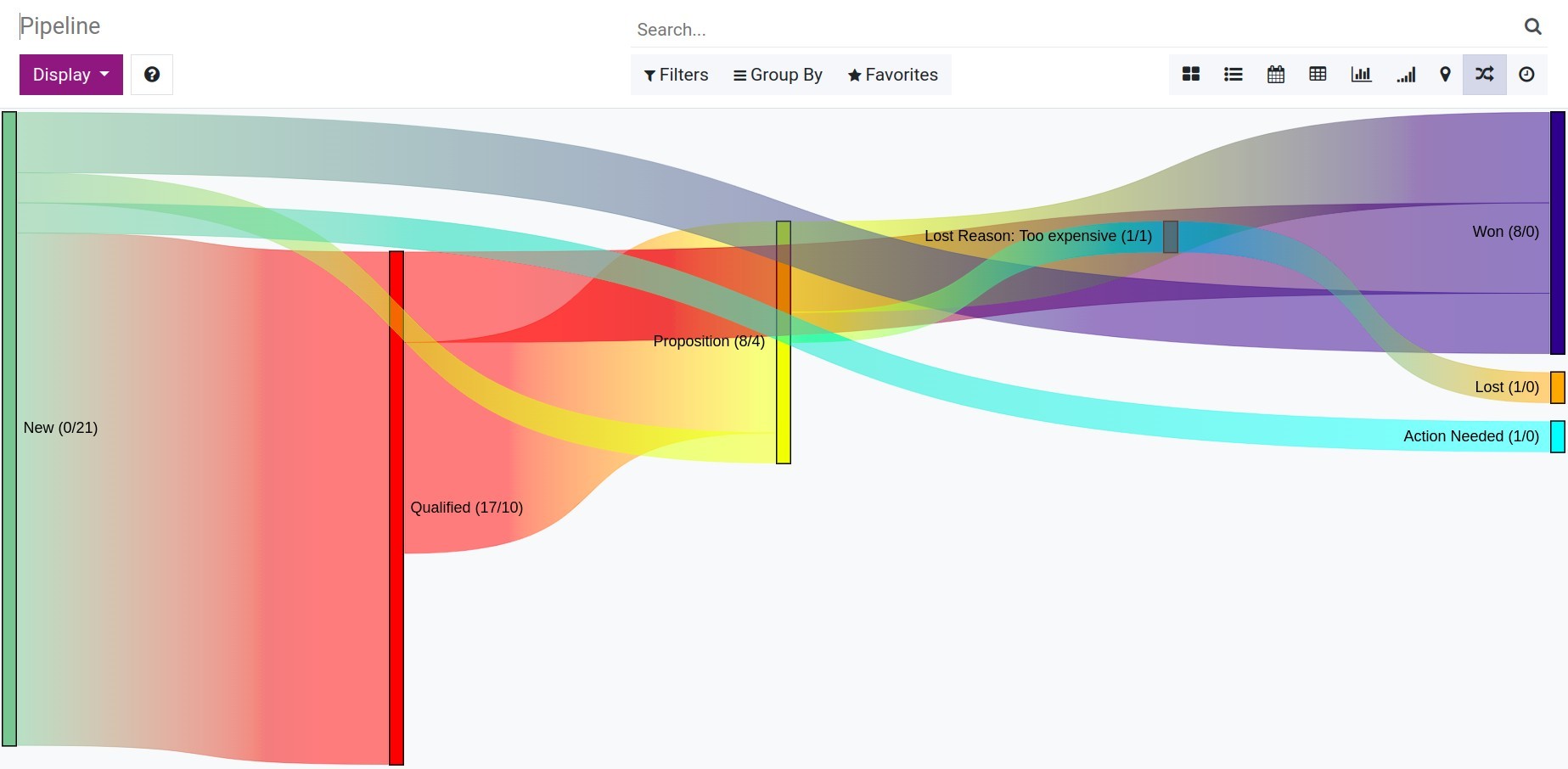
Some points that you should know to understand the Sankey Chart in Viindoo CRM:
Each block on the chart represents a stage of the CRM process by default.
New: The new opportunities,
Qualified: The opportunities are already qualified,
Proposition: The opportunities are already proposed, which mean you sent the quotation to the customers,
Won: Mark won the opportunities,
Lost: Mark lost the opportunities with the reason and each reason will display as a block.
Each line on the chart represents the connection and the flow of the process.
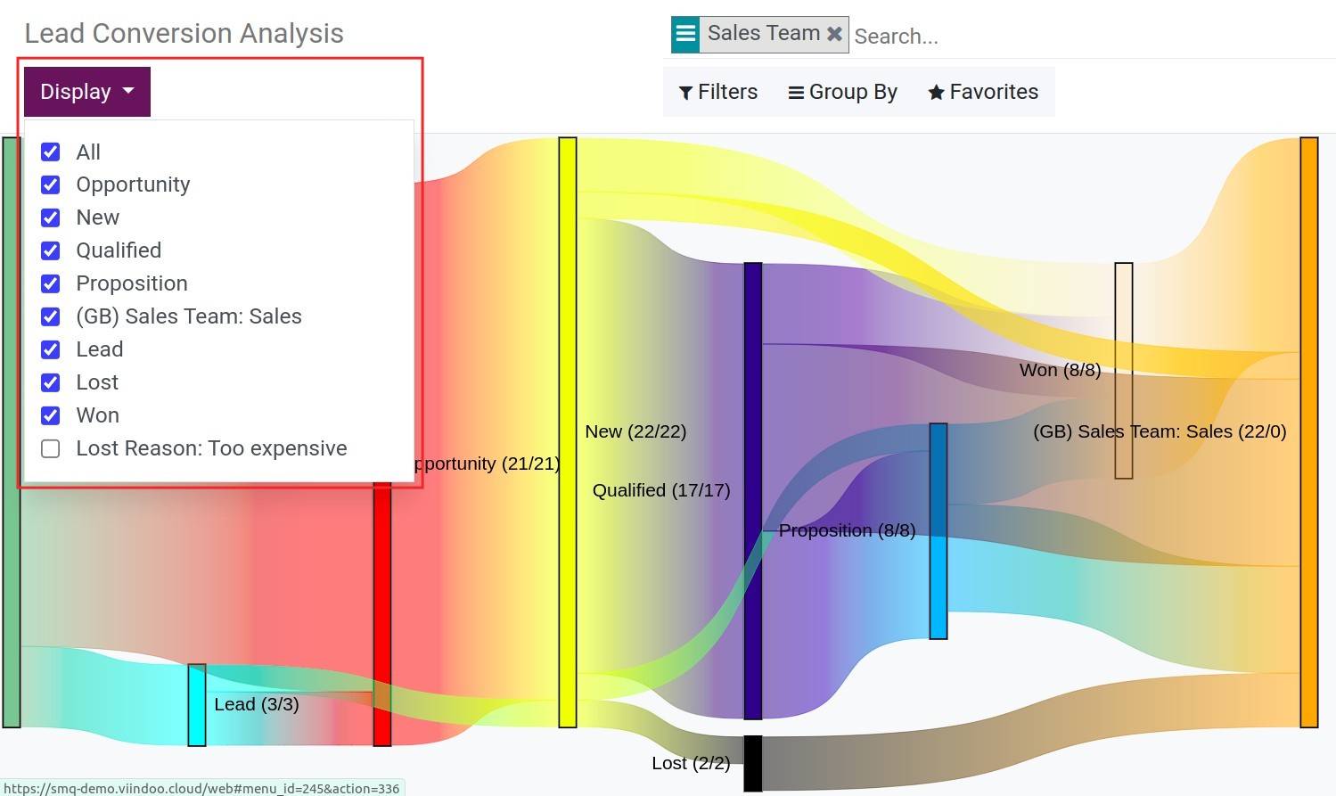
The number shown next to each block (such as Qualified (12/5)) displays the number of incoming opportunities in this stage (12) and the number of outgoing opportunities that move to the next stage (5). Sometimes, these numbers are not equal since there might be some opportunities that are still at that stage.
To see the detailed number of a certain line, hover the cursor to said line according to your needs.
As you can see from the data in the example below, the conversion rate is 3/16, which means we have won 3 opportunities out of the total of 16 opportunities.
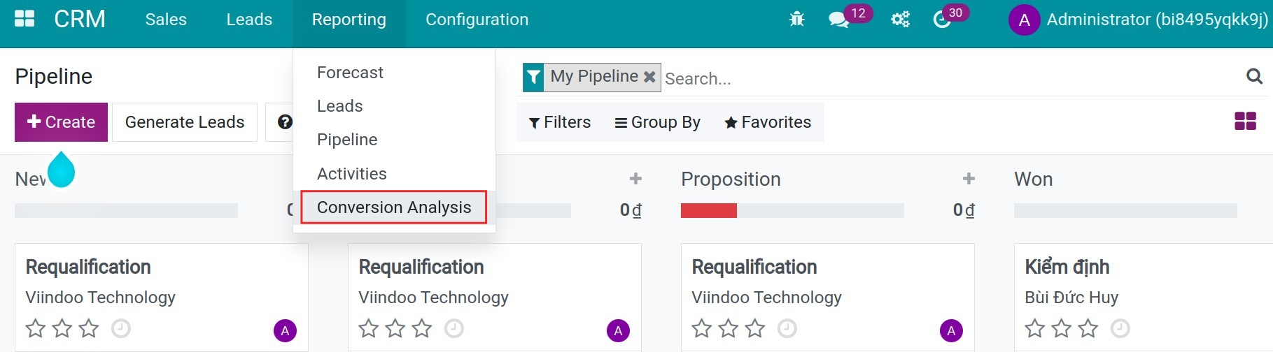
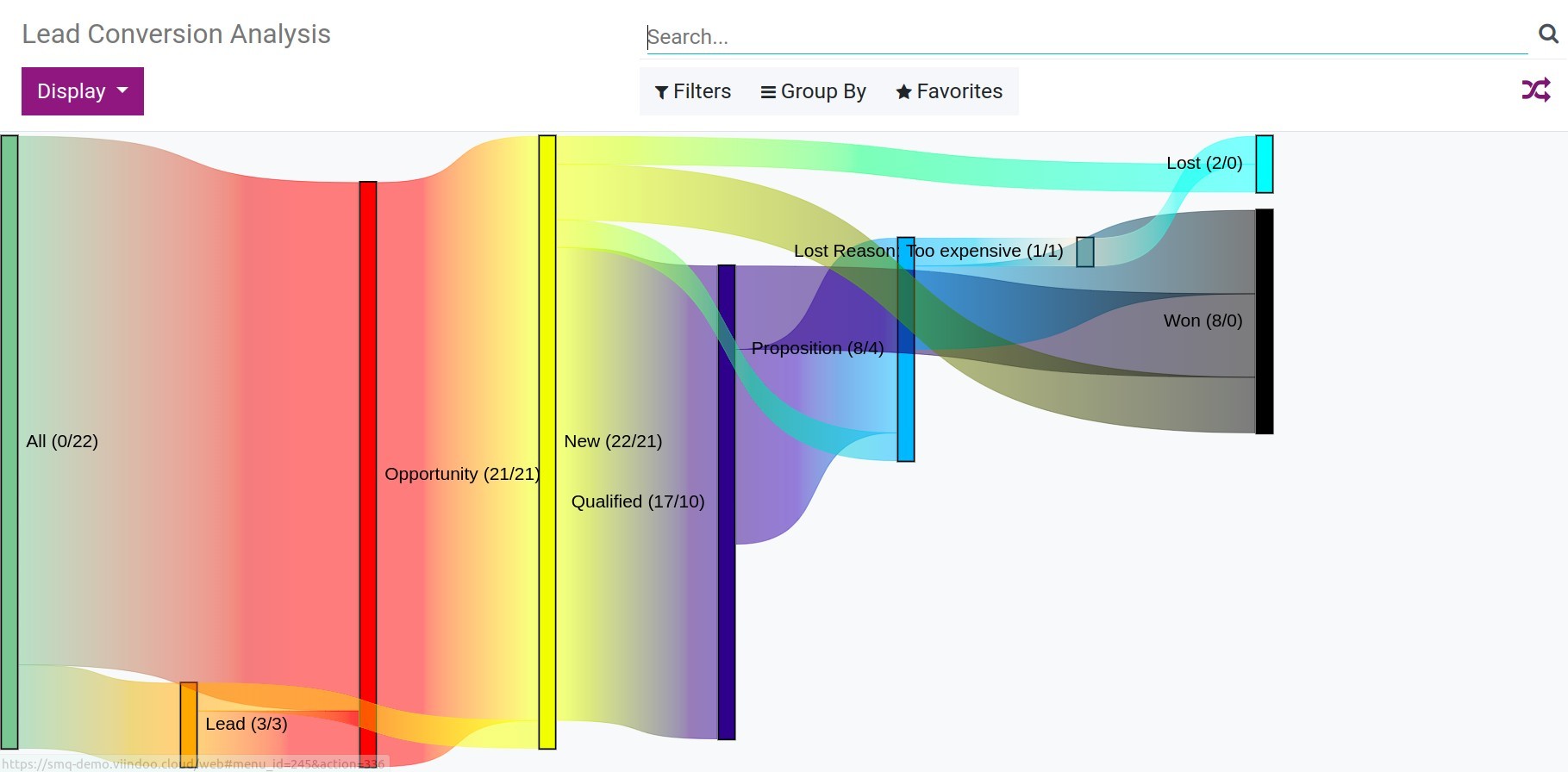
On the other hand, you can see the Lead conversion report by navigating to CRM ‣ Reporting ‣ Conversion Analysis:
In this chart, you can see more Lead and Opportunity block to visualize the flow from lead to opportunity and the following process. Besides, you also can view the conversion rate of your leads: the number of won opportunities divided by the total number of leads. In the example below, we have a conversion rate is 8/22.
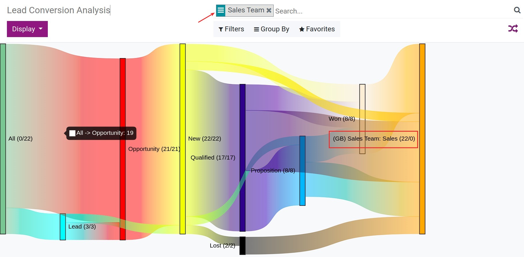
You can use the Filter or Group by feature to show more blocks and connections in the chart. For example, select the Sales team criteria to analyze by the sales team.
To determine the block that can be shown in the report, you can press the Display button and select the block that you want:
See also
Related article
Optional module