Payroll Analysis
The Payroll analysis report gives you an overall picture of the salary, bonus, and expenses in the company according to monthly, and annual analysis data. With the Viindoo Payroll management app, payslip data is obtained from time-off and attendance, meal registration data, etc. which are updated daily, and hourly, therefore, the salaries analysis reports will also be updated instantaneously and accurately.
Flexible salary analysis reports from pivot analysis to visual charts by time, department, employee, and more.
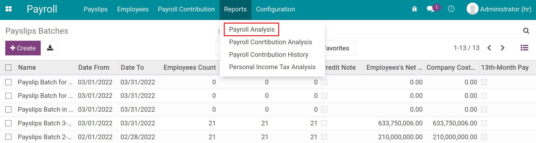
To view payroll analysis report, navigate to Payroll ‣ Reports ‣ Payroll Analysis:
Payroll Analysis report in pivot table
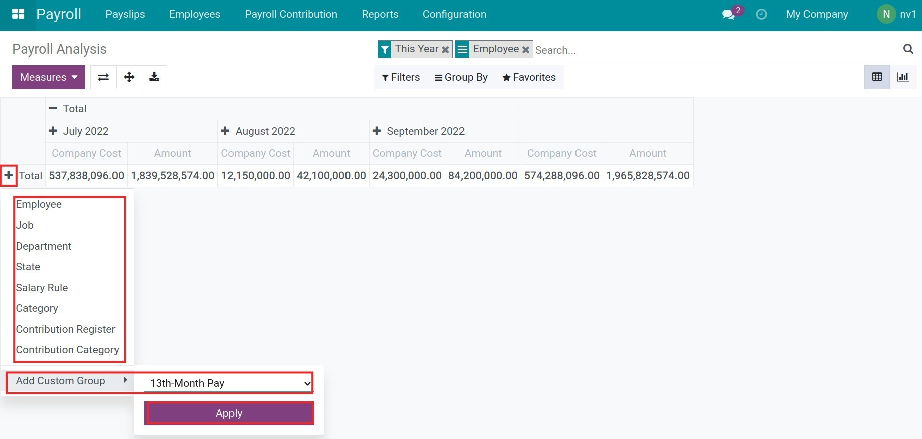
Analysis with two main measures are Amount and Company Cost:

Flexible report criteria by the filter and group feature according to your using purpose. It could be grouped by employees to view the salary report of each employee, or by positions to analyze the salary of each job position, etc.
Save the report templates by using the Favourites feature to use as default or share with others in the system:
![Favourite filters - Viindoo Payroll app]()
You could combine the criteria by clicking on the (+) button to select more:
![Combine the report criteria - Viindoo Payroll app]()
You could also export data in the form of excel with this type of report.

Payroll Analysis report in graph
Besides the pivot analysis report, the Viindoo Payroll app provides the other reports in the form of graphs as follows:
Bar chart;![Bar/column chart of payroll analysis - Viindoo Payroll app]() Line chart;,
Line chart;,![Area chart of payroll analysis - Viindoo Payroll app]() Pie chart.
Pie chart.![Pie chart of payroll analysis - Viindoo Payroll app]()
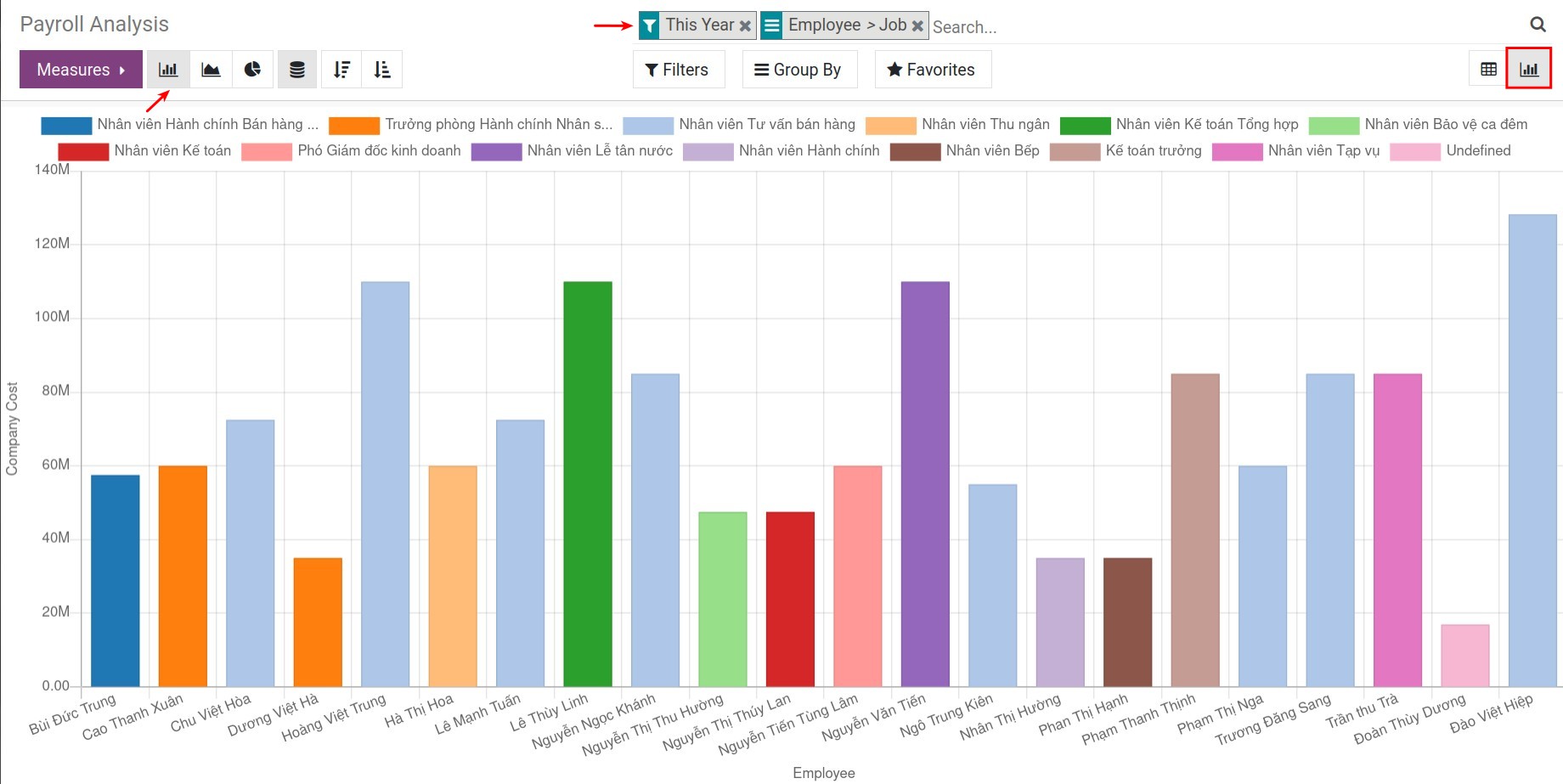
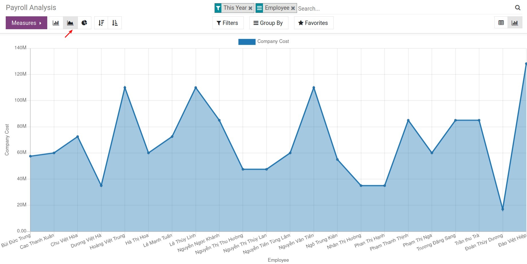
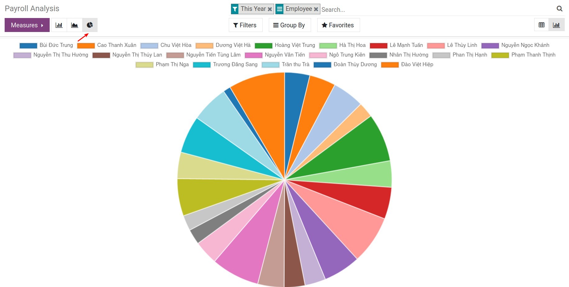
With the chart reports, you could track the fluctuations of salary expenses for each employee, job position, department, and so on in the company.
Note
The reports in the form of graphs/charts have the vertical axis based on Measures, the horizontal axis based on Group by. You can combine different criteria to display the reports as desired.
See also
Related article
Optional module