Introduce about fields, widgets and views
In Viindoo Customizer, there are three key concepts: fields, widgets, and views:
Fields: Fields represent the data elements or attributes of a particular object. Fields determine the structure and content of the records in a database table. With Viindoo Customizer you are allowed to create and modify fields to tailor your application to your specific business needs. By customizing fields, you can capture and store the information that is relevant to your organization.
Widgets: Widgets are the user interface components used to display and interact with the data in fields. They provide different ways to present and manipulate data in a user-friendly manner. You can configure widgets for your fields to enhance the user experience and ensure that data is captured accurately.
Views: Views define how data is displayed and organized in the applications. A view is a visual representation of one or more records that allows users to interact with the data.
Requirements
This tutorial requires the installation of the following applications/modules:
Fields and Widgets
Viindoo Customizer support many type of fields. It will help you flexibility to create tailored interfaces that improve user productivity and efficiency.
Basic fields and their widgets
Text and Char
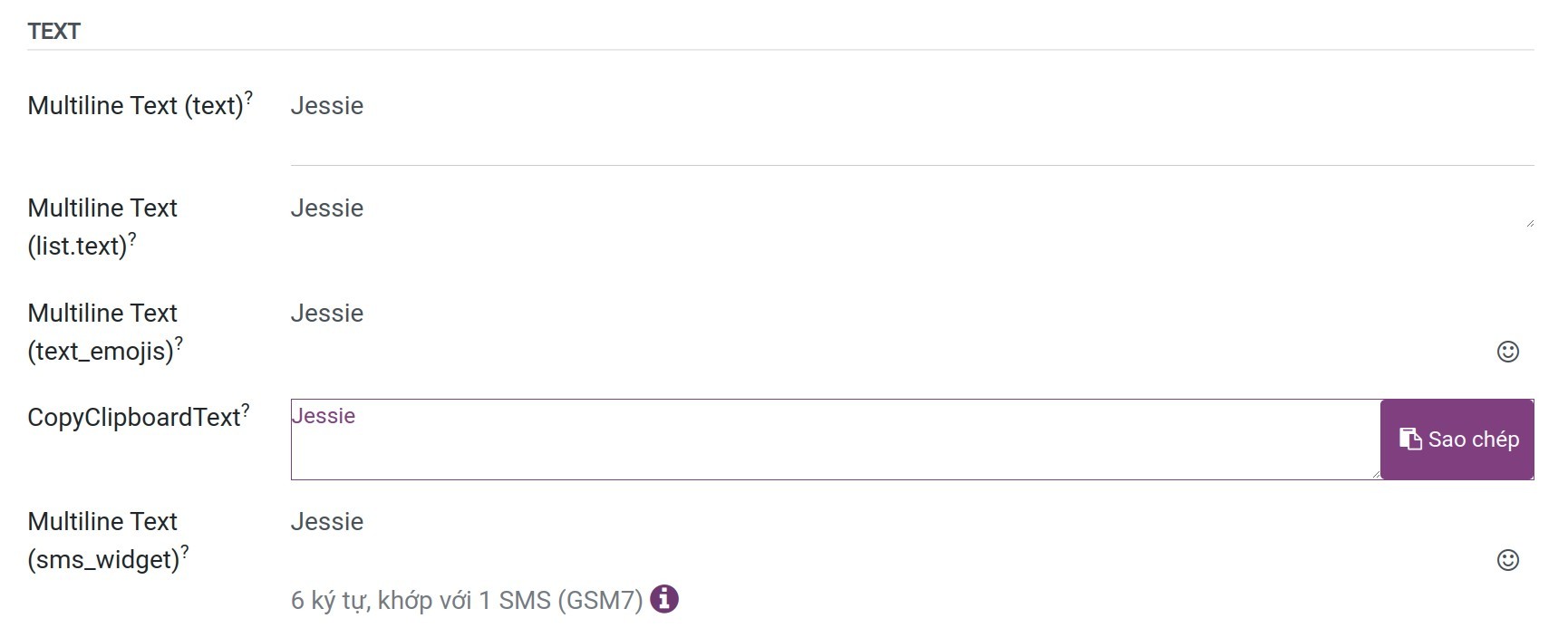
Text: The field is used for longer text containing any type of character. Two text lines are displayed on the UI when filling out the field. The widgets have supported includes:
Multitext (text) and Multiline Text (list.text): Display the text when filling out the field.
Multiline Text (text_emojis): Display the text when filling out the field and you can choose more emojis.
CopyClipboard: Users can copy the value by clicking a button.
Multiline Text (sms_widget): If enable SMS to add an option to send an SMS directly from Viindoo.
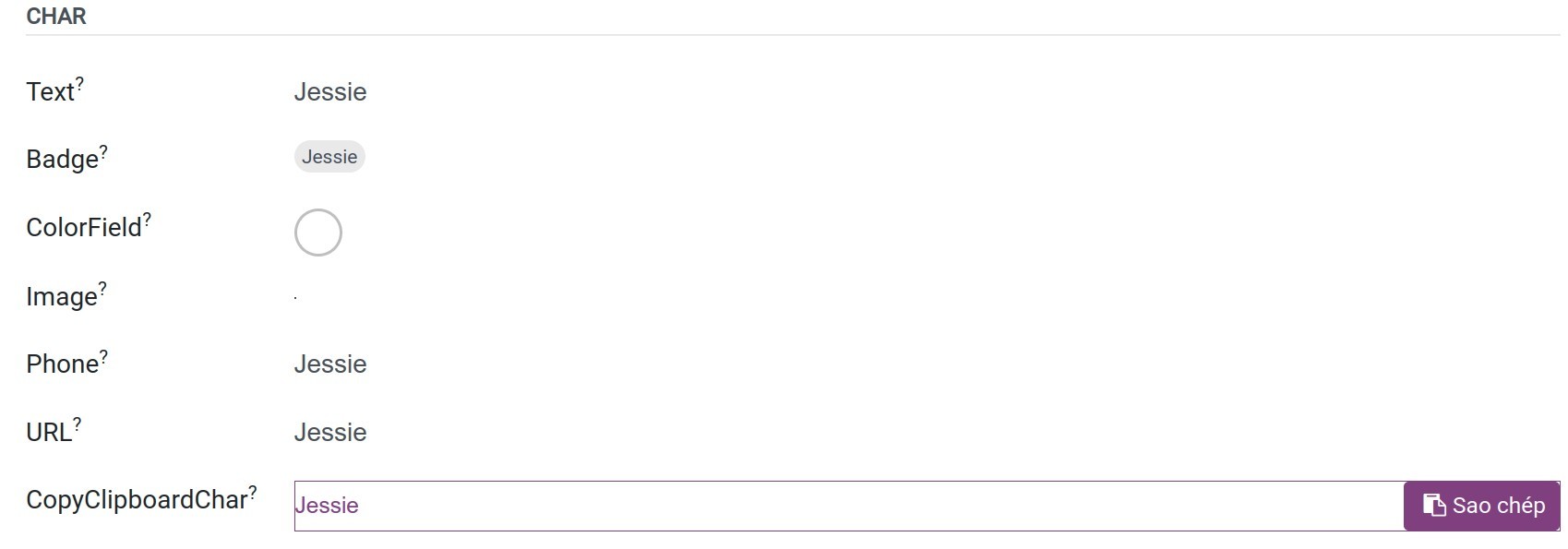
Char: The Text field is used for short text containing any character. The widgets have supported includes:
Text: Display the text when filling out the field.
Badge: Displays the value inside a rounded shape, similar to a tag.
ColorField: Displays the value in color.
Image: You can choose and store the image files at this field.
Phone: The value becomes a clickable number to send SMS or make a call.
URL: The value becomes a clickable url and can navigate directly to this link.
CopyClipboard: Users can copy the value by clicking a button
HTML
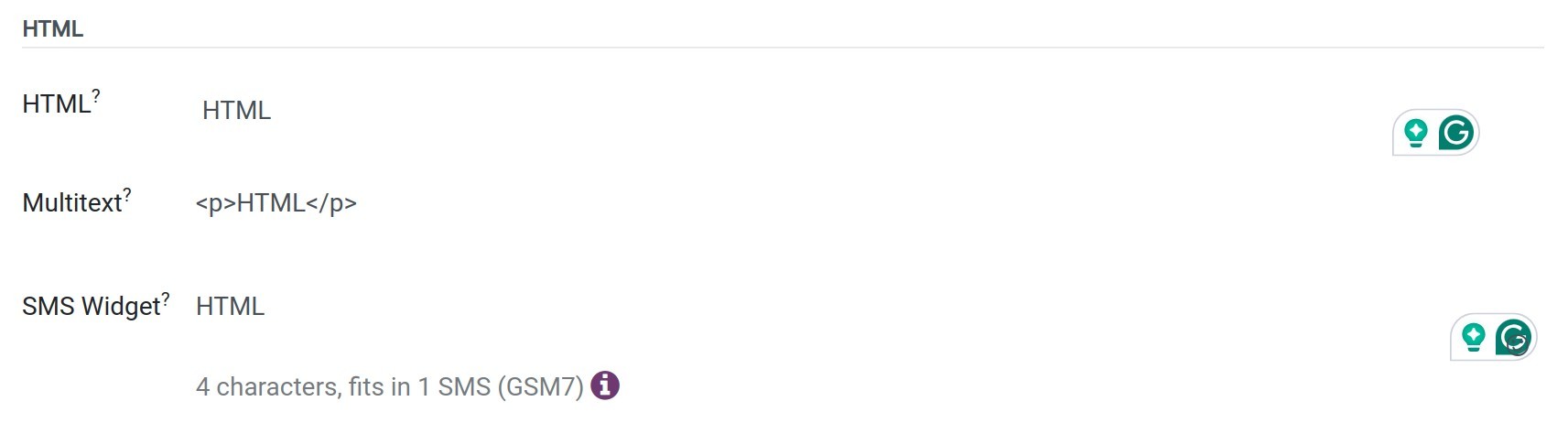
HTML: The Html field is used to add text that can be edited using the HTML editor. The widgets have supported includes:
HTML;
Multitext;
SMS Widget;
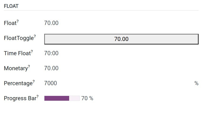
Float and Integer
Float: It is capable of representing both whole numbers and fractional values with a decimal point. The widgets have supported includes:
Float: The value is displayed in a decimal number.
FloatToggle: The value is displayed in a decimal number, you can change the value by pressing this button.
Time Float: The value is displayed in time format hh:mm with the limited 59 minutes.
Monetary: The value is displayed in a monetary number with decimal format.
Percentage: The value is displayed in a percentage format. Example 7 will display as 700%.
Progress Bar: The value is displayed in progress bar format.
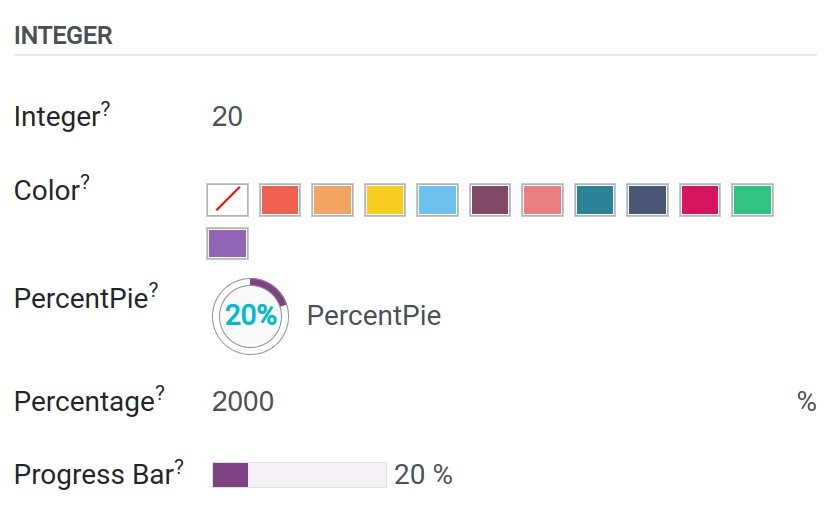
Integer: It is a type of data field used to store whole numbers (integers). It represents a numerical value with no fractional or decimal part. The widgets have supported includes:
Integer: The value is displayed in a numeric number, no decimal part.
Color: The value is displayed in a color.
PercentPie: The value is displayed in pie format with percentages.
Percentage: The value is displayed in a percentage format. Example 7 will display as 700%.
Progress Bar: The value is displayed in progress bar format.
Date and Datetime
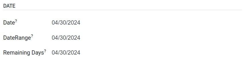
Date: It is designed to hold specific calendar dates, including the day, month, and year components. Example: 2024-03-09. The widgets have supported includes:
Date: It allows users to choose the date value.
DateRange: It allows users to specify a start date and an end date, defining a range that encompasses a period of time.
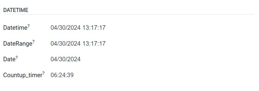
Datetime: It is used to store and represent both a date and time together. It combines the components of a date (day, month, and year) with the components of time (hours, minutes, seconds, and optionally milliseconds). Example: 2024-03-09 12:15:00. The widgets have supported includes:
Datetime: It allows users to choose the datetime value.
DateRange: It allows users to specify a start date and an end date included time, defining a range that encompasses a period of time.
Date: The datetime will be displayed by the date value.
Countup_timer: It is displayed by the time is counting from the chosen date.
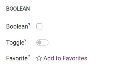
Boolean
Boolean: The boolean field is used when a value needs to be true or false. The widgets have supported includes:
Boolean: The value will be displayed as a checkbox button.
Toggle: The value will be displayed as a toggle button.
Favorite: The value will be displayed as a star of favorite button.
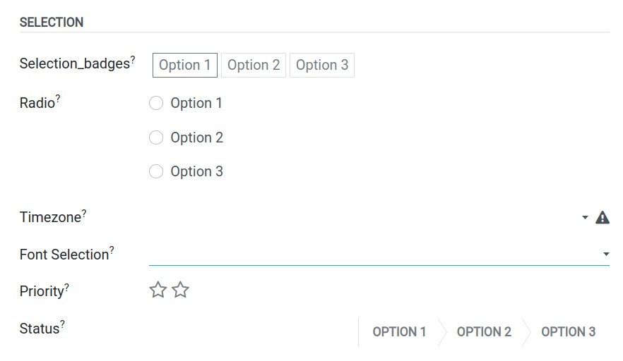
Selection
Selection: The selection field refers to the field type that allows user can choose one or some values on the option list. The widgets have supported includes:
Selection_Badges: The choosable option will display as the badges.
Radio: The choosable option will display as the radio type and you can tick into these options.
Timezone: The selections will display with the timezone icon.
Selection: The normal dropdown type of the option list.
Priority: It will displayed as the star indicates the priority.
Status: The option list will displayed as the status progress.
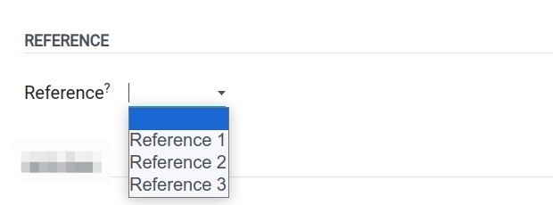
Reference
Reference: Refers to a field type that allows you to create a reference or link to another record in the system. It allows you to establish relationships between different records within the database.
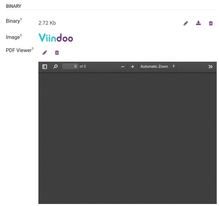
Binary
Binary: Refers to a field type that allows you to store binary data, such as images, documents, or any other type of file, within the database. The widgets have supported includes:
Binary (File): The files will be displayed as binary files.
Image: The files will be displayed as the picture type.
PDF Viewer: The files will be displayed on the viewer screen.
Monetary
Monetary: Refers to a field type that is used to represent monetary values or amounts in a specific currency.
Advanced fields and their widgets
Three types of advanced fields can be used on Viindoo Customizer to link a model to other models:
Many2one,
One2many,
Many2many.
So what is the model? Model refers to a class that represents a specific entity or concept in the system. It serves as a blueprint for creating and manipulating records in the database. Each model represents a table in the database and encapsulates the fields, methods, and behavior associated with that entity. Models define the structure of the data, and its relationships with other models, and provide functionalities such as data validation, access control, and business logic.
Many2one and Many2one_reference
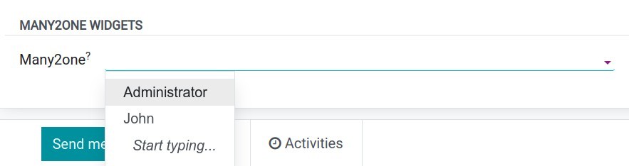
The Many2one field refers to a field type that establishes a many-to-one relationship between two models. It allows you to create a link from one model to a single record in another related model. From this field, you can go directly to the record’s details. The widgets supported include:
Many2one: This is the default widget of Many2one. It will be displayed as a dropdown list and you only choose or create or edit this related record.
One2many
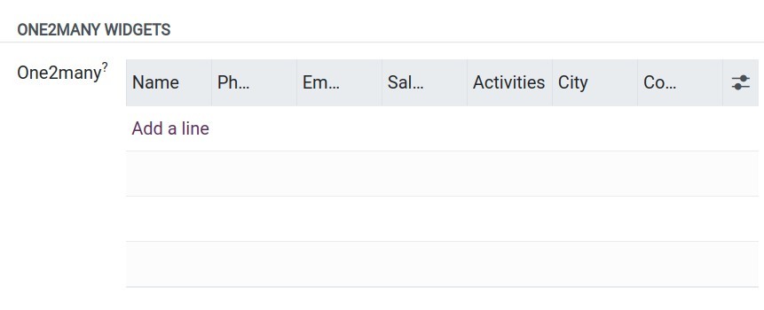
The One2many filed refers to a field type that establishes a one-to-many relationship between two models. It allows you to create a link from one model to multiple records in another related model.
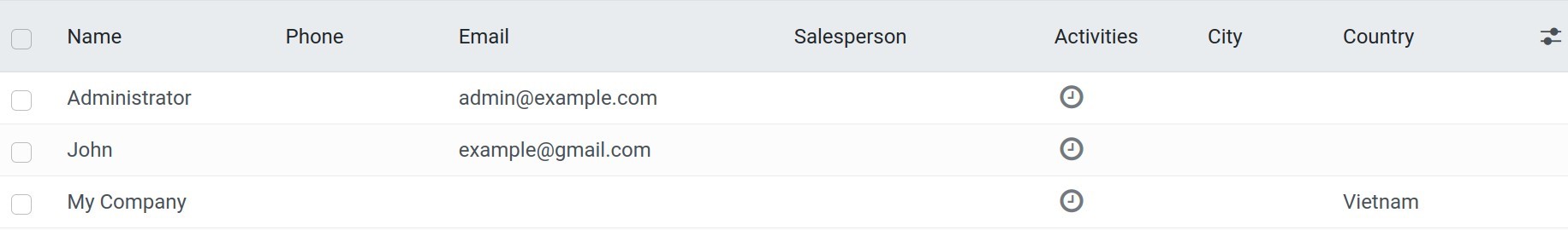
For example: This field has one2many relationship with the model res.partner:
Note
To create a one2many field in the specific model, you must create the many2one field in the related model that establishes the reverse relationship. For example, you need to create a Contacts field with one2many type on the new model, so you need to create a new field with many2one type on the model ‘res.partner’.
The widgets have supported includes:
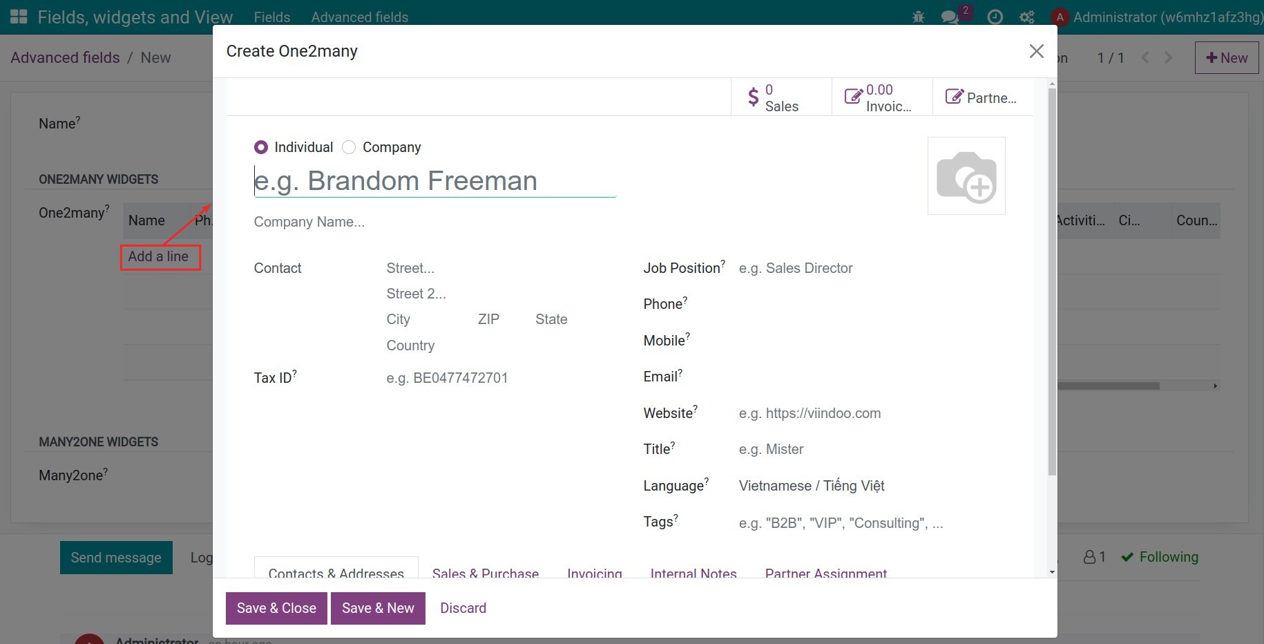
One2many: This is the default widget of One2many. It will be displayed as a popup window and you only can create or edit this related record.
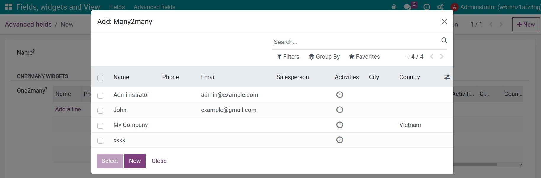
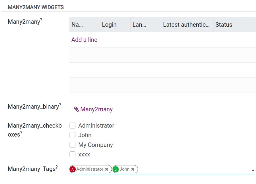
Many2many: It will be displayed as a popup window and you can choose the series of records or create a new one.
Many2many
The Many2many field is a common field type used to establish a many-to-many relationship between two models. It allows you to create a relationship where multiple records from one model can be linked to multiple records from another model.
Views
Views are an essential part of the user interface (UI) design and define how data is displayed, organized, and interacted with in the system. Views determine the structure, layout, and appearance of records and their fields in the interface. In Viindoo Customizer, when creating a new model you can be supported with: Tree view, Form view, Graph view and Pivot view.
Tree view: It presents records in a tabular format, similar to a spreadsheet or a list. Tree views are commonly used to display multiple records simultaneously, allowing users to navigate and filter data efficiently.
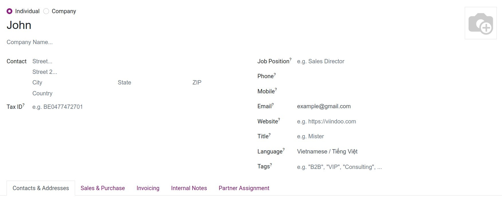
Form view: It is used to display and edit individual records. Each field of the record is represented by an input widget in the form view. Users can enter or modify data directly in the form view.
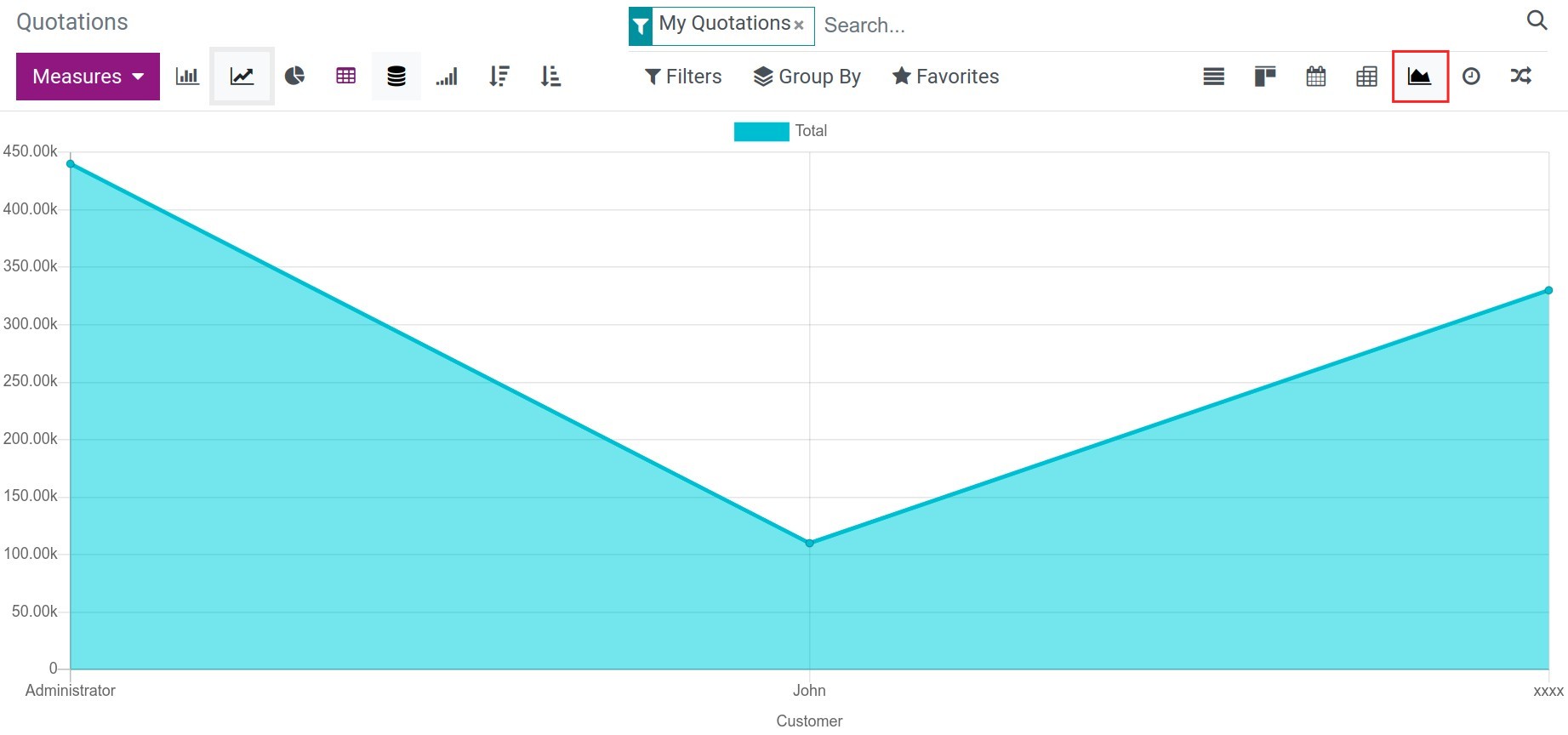
Graph view: It presents data in the form of graphical charts or graphs, allowing users to visualize and analyze data trends, comparisons, or distributions.
Pivot view: It offers a summarized view of data through pivot tables. Users can define row and column dimensions and perform calculations on numerical data, providing a flexible way to analyze and summarize information.